


The Pacific Islands have an abundance of globally superb products and the True Pacific initiative, supported by the Pacific Cooperation Foundation, brings the best of these to New Zealand.
With a uniquely independent Pacific lens the Pacific Cooperation Foundation (PCF) focuses on strengthening the bonds that connect Aotearoa New Zealand with the Pacific Moana. It provides platforms to uplift, amplify, inform and equip Pacific peoples and communities spanning the breadth of Polynesia, Melanesia and Micronesia.
A new initiative was formed to celebrate and highlight Pacific Island companies who source local ingredients for the creation of the highest quality products in the Pacific, meeting the strictest quality criteria.
PCF required a name and brand identity for this initiative that captured the spirit of the Pacific while communicating business excellence.
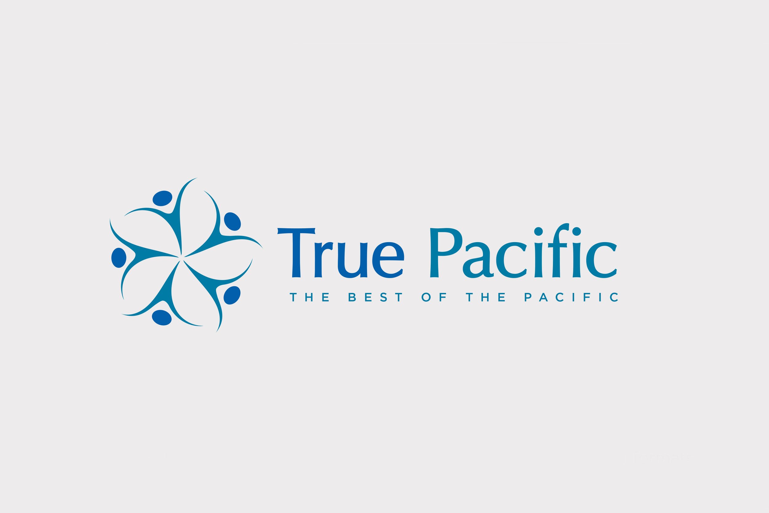
Inspired by the warmth of the people and the natural beauty of the region, True Pacific was developed. The 'unity flower' logo marque was crafted to represent the idea of people coming together/working together to achieve a common goal of perfection. At first glance you may see the simple elegance of the common-to-the-pacific frangipani flower. On second glance you may notice the flower is in fact made up of a series of stylised people forms.
The name 'True Pacific' is set in a sans serif font with subtle thicks and thins in it’s letterforms. This is riffing off the similar thicks and thins in the logo mark and also demonstrates that while True Pacific is all business, it’s business with a soul.
Everything from the freshest mangoes and coffee through to the most luxurious body creams from the Pacific Islands carry this seal of approval. Therefore the quality mark design had to work well at a very small size - just like the stickers found on apples in supermarkets - and to not take up too much space on the packaging design of other products.

Two colour ways plus a metallic option in addition to various stacking options allowed greatest flexibility to apply the quality mark while complimenting products and their existing packaging. A full brand document showing the quality mark design and it’s rules and recommendations around application was also designed to help deliver the initiative to stakeholders.
True Pacific awarded the first licence to Pure Fiji, in recognition of the outstanding quality of the products as well as the company's commitment to empowering staff and raw material producers and for their dedication to environmental responsibility.


Collaborators: Tardis Design