Takaro: Brand Identity
Creative Direction | Art Direction | Design

Brought to you by the National Library of New Zealand, Tākaro is a Gaming and eSports events platform designed to an identity was crafted to connect with and educate tamariki and rangatahi and position the Library as the hub of sharing knowledge through interactive and modern technology. Tākaro’s identity speaks to the current gaming visual language with the aim to support and inspire young people and their whānau.
Gaming has a bad rep. ‘Tākaro’ is about to change that by showing that eSports is a way for young people to connect with their peers as well as professionals in the industry in a positive way.
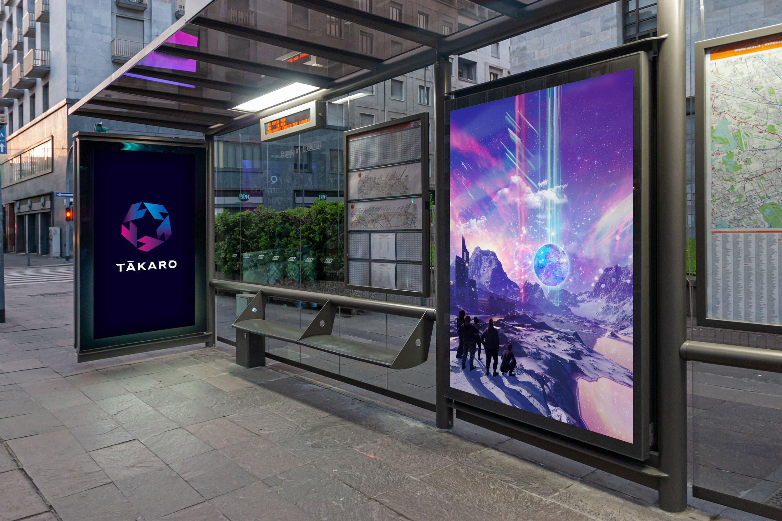
The visual language of gaming is rich with inspiration. In order to capture the attention of our target audience Tākaro’s identity looks and feels authentic to the industry and stands strongly as something separate and special from other NZNL programmes. To help achieve this, a hero image along with an ‘emblem’ has been crafted to comfortably sit amongst international gaming trends; the current games and the professional gamers/brands.


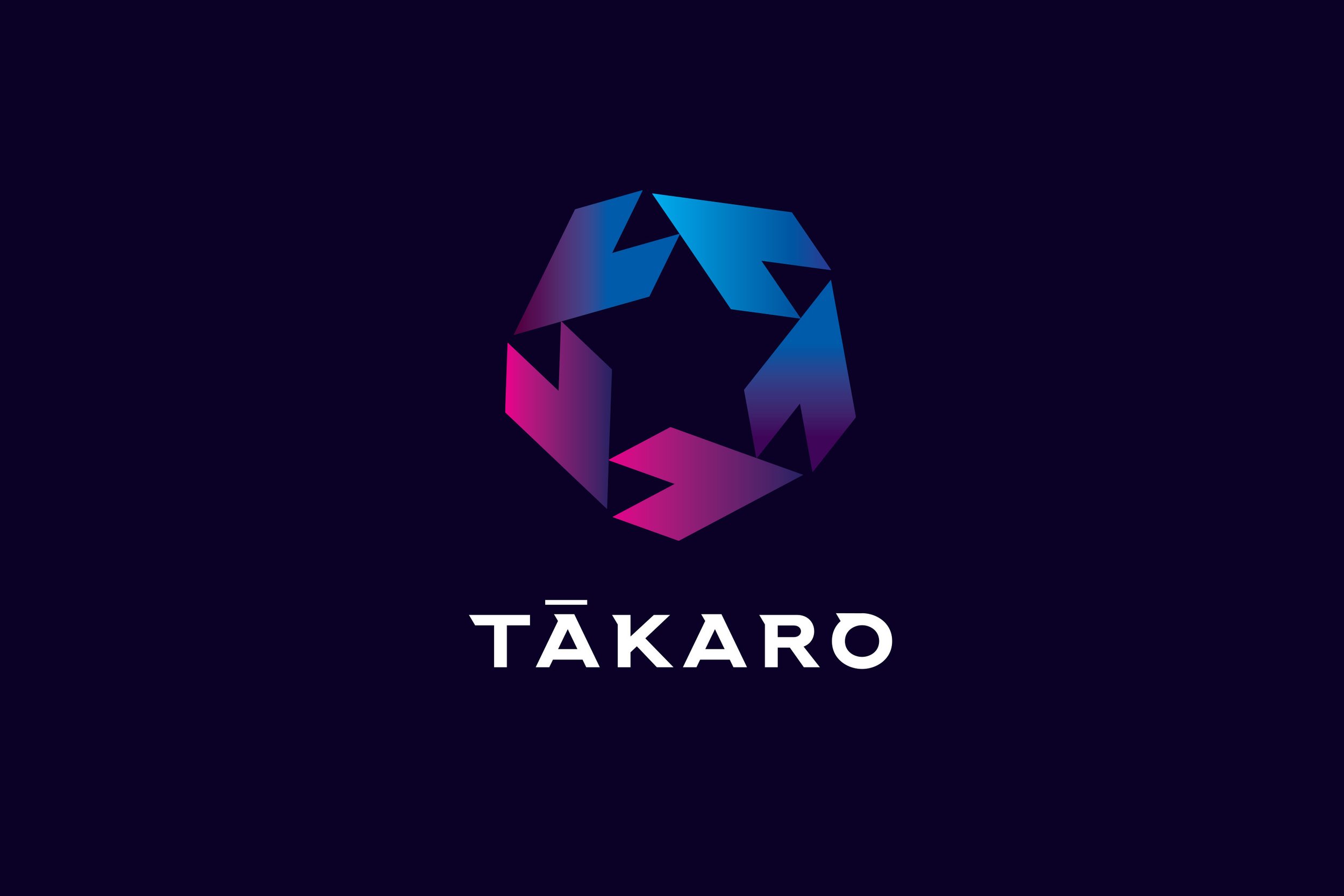
Tākaro Star (emblem/logo)
Complimenting the campaign/hero image also created for Tākaro, a logo/emblem needs to bring a strong sense of aspirational excellence to indicate the potential of this platform and industry.
Gaming is a serious profession and success is rarely based on talent alone. One needs to transform their mindset to have the right level of discipline to apply to the task, studying past game performances and seeing where improvements can be made. Working iteratively towards excellence (and winning) is of course part of the thrill!
A simple and bold emblem/logo has been designed to convey the concept of coming together and working as a team in addition to the concept of mental and physical excellence leading to iterative success. Synonymous with dreaming big and achieving your best is the iconic star, in conceptual and symbolic form.
The saying, “Reach for the stars” has been a motivational idea as far back as current generation/s can remember. We are rewarded with star stickers or stamps on our school work, stars can be ‘wished’ upon, while you can also be called “a star” or even a “Superstar”!
This very simple symbol is rich with meaning and narrative, and for the vast majority of symbolic attributes, it is always associated with something positive and aspirational. A star can convey excellence while also being celestial and majestic – is it not essential to first let ourselves dream to then achieve?
The star is made up of five individual ‘pointer’ shapes. The ‘pointer’ is designed almost like an arrow head, provoking thought of ‘action’, ‘moving forward’ and ‘agency’. When these five pointers are arranged radially, they create a star formation. It is this the coming together of the five individuals, with their skill, action and dedication to positive progression that makes a strong team – the Tākaro star; Simple. Effective. Evocative.
On a practical level the Tākaro star will be easy to reproduce across various mediums (online ads, printed material, physical merchandise etc). These needs inform it’s construction and minimal embellishment.
The emblem is strong enough to be reduced down to a ‘flat’ composition/shape and looks modern to ensure its relevance to our audience. Clean lines help achieve this with an exciting colour mix of neon pink, cyan/blue fading through rich purples.
The Tākaro star is complimented by a simple font for the word-mark (name of Tākaro). It is legible, modern and has a sense of edginess to it, in line with other gaming brands.
