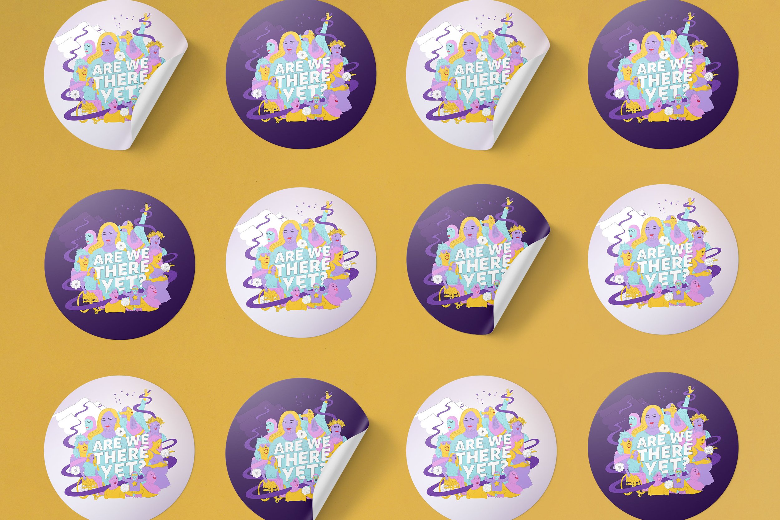

The National Library of New Zealand commissioned a brand identity to help launch the new kōrero series ‘Are We There Yet?’. Showing the collective power of women – our journey from the beginnings of the suffrage movement through to contemporary feminism, future-forward this identity looks to inspire our continuous momentum in seeking recognition, our worth and our place in today’s modern world.
This identity is future focused. While our foremothers courageously carved the path, it is now our mission to keep the vision, the drive and the determination to keep going!
This journey extends to unknown territory, seemingly insurmountable hills, twists and turns, the occasional dead end and ultimately a glorious destination. On our way we create a well chartered path. A path our tamariki (children) can follow with confidence, empowered to journey further when it’s their time.
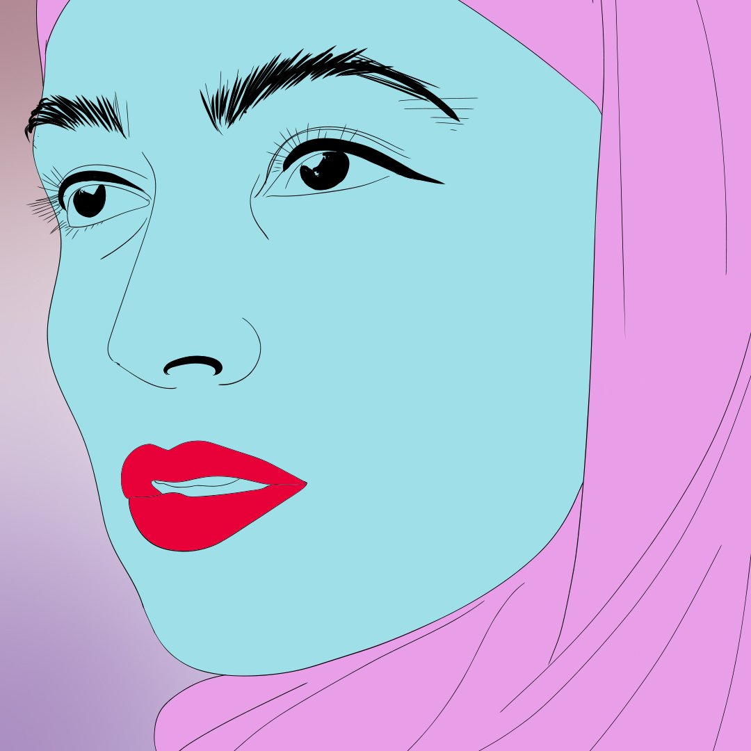
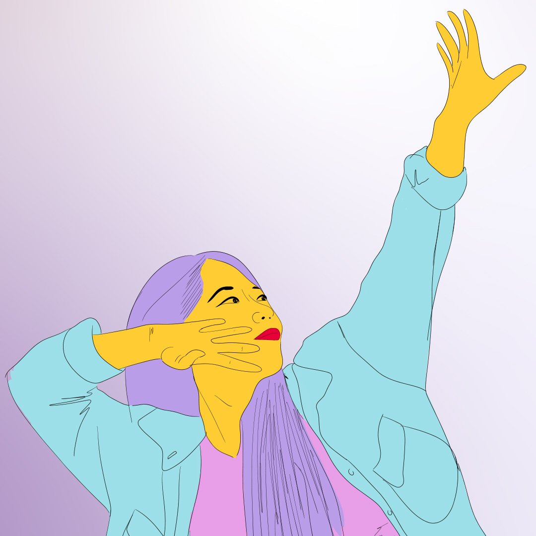
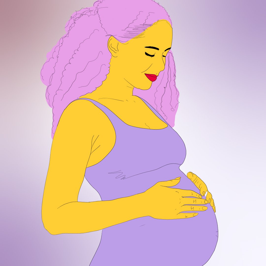
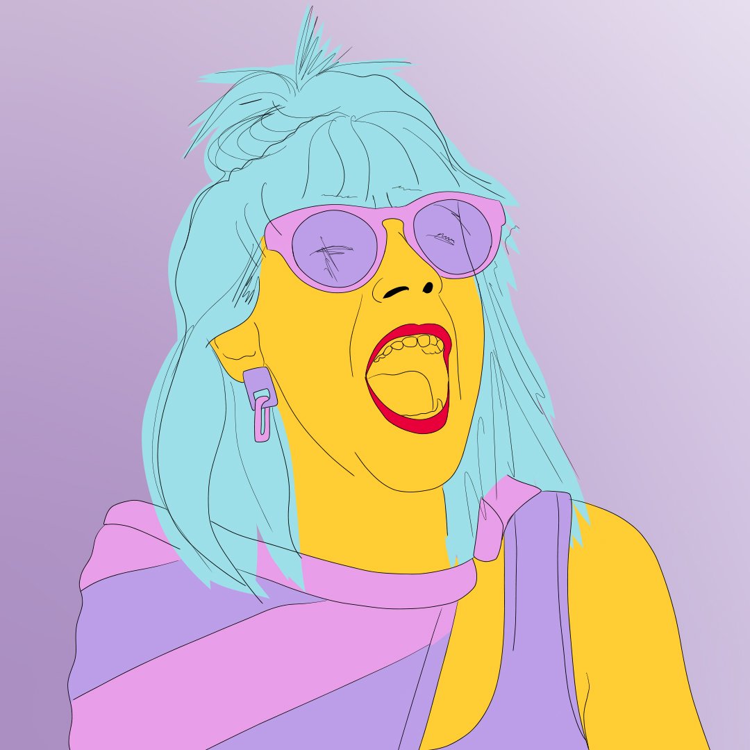
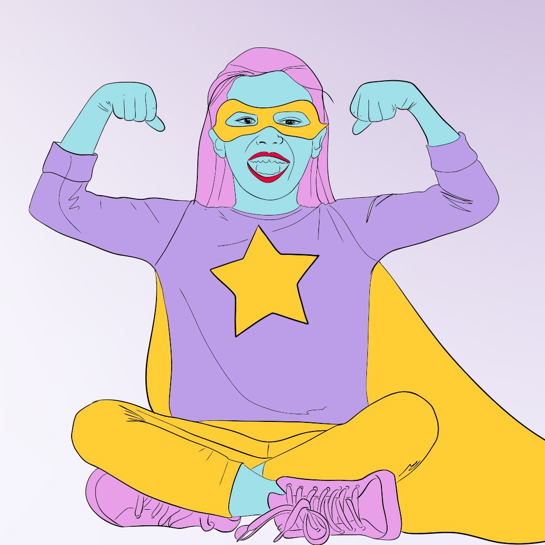
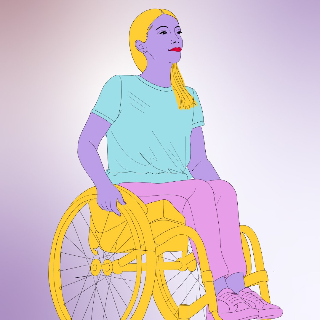
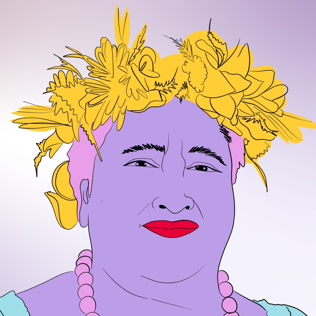
Women from all walks of life have been carefully considered to showcase; different ages, stages, cultures, abilities and sizes. They are our champions, muses and heroines – sparkling and shining as the primary focus of the design. These women are not our typical well-known historical figures of the movement, rather they are regular people, just like you and me ... legends in the way they interact within their environment (physical and political). Think of them as the coolest and most relevant punk rock band to hit the scene.
A natural backdrop is subtly set around our heroines. A hilly landscape reveals a long winding path that wraps around our key figures. The Matariki star cluster features high in the background as a navigational tool, helping us find the way. Individual white camellias are placed in amongst our muses as an acknowledgment to the white camellia as the symbol of New Zealand women’s suffrage.
Every piece in this composition is lovingly hand drawn using a simple and confident style – a deliberate choice – achingly raw, just like our emotions in relation to our place, as women, in society. It made sense for this identity to feel deeply human … not a straight line or clean edge in sight.
The identity’s beauty lies in its imperfection within a layered composition that aims to offer a little more at each glance. Fine and minimal detail gives focus to each heroine and allows their individuality to have a place. The title, ‘Are We There Yet’ is seamlessly part of the design, again, hand-rendered and full of personality.
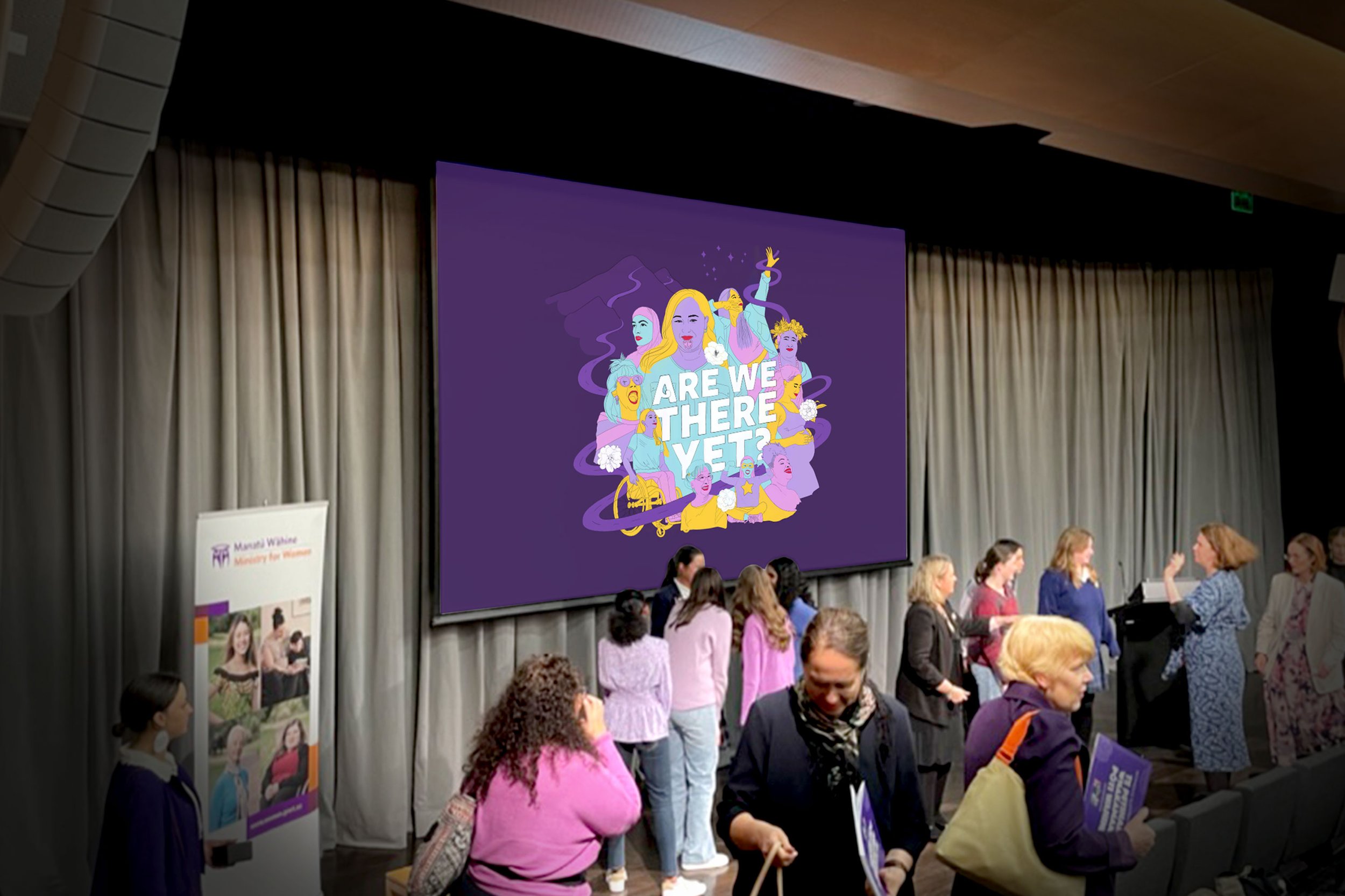
A reduced and elegant colour palette unifies our heroines and scene. The strong and deep purple synonymous with the Suffrage petition/movement is offset by softer and complimentary hues; a pale pink, blue, mauve and yellow/gold. These exclusive colours are used for every element and provide a neutral way to show hair and skin colour amongst our women.
This identity has been designed to work hard for the National Library as the face of many talks and workshops to come as part of the Are We There Yet series. It has been created to be used across print campaigns, tickets, digital material as well as a bespoke presentation template for speakers.
Engaging the public with an evocative platform like this helps place the National Library firmly as the hub of thought leadership and idea exchange; all key ingredients for a thriving culture in Aotearoa.