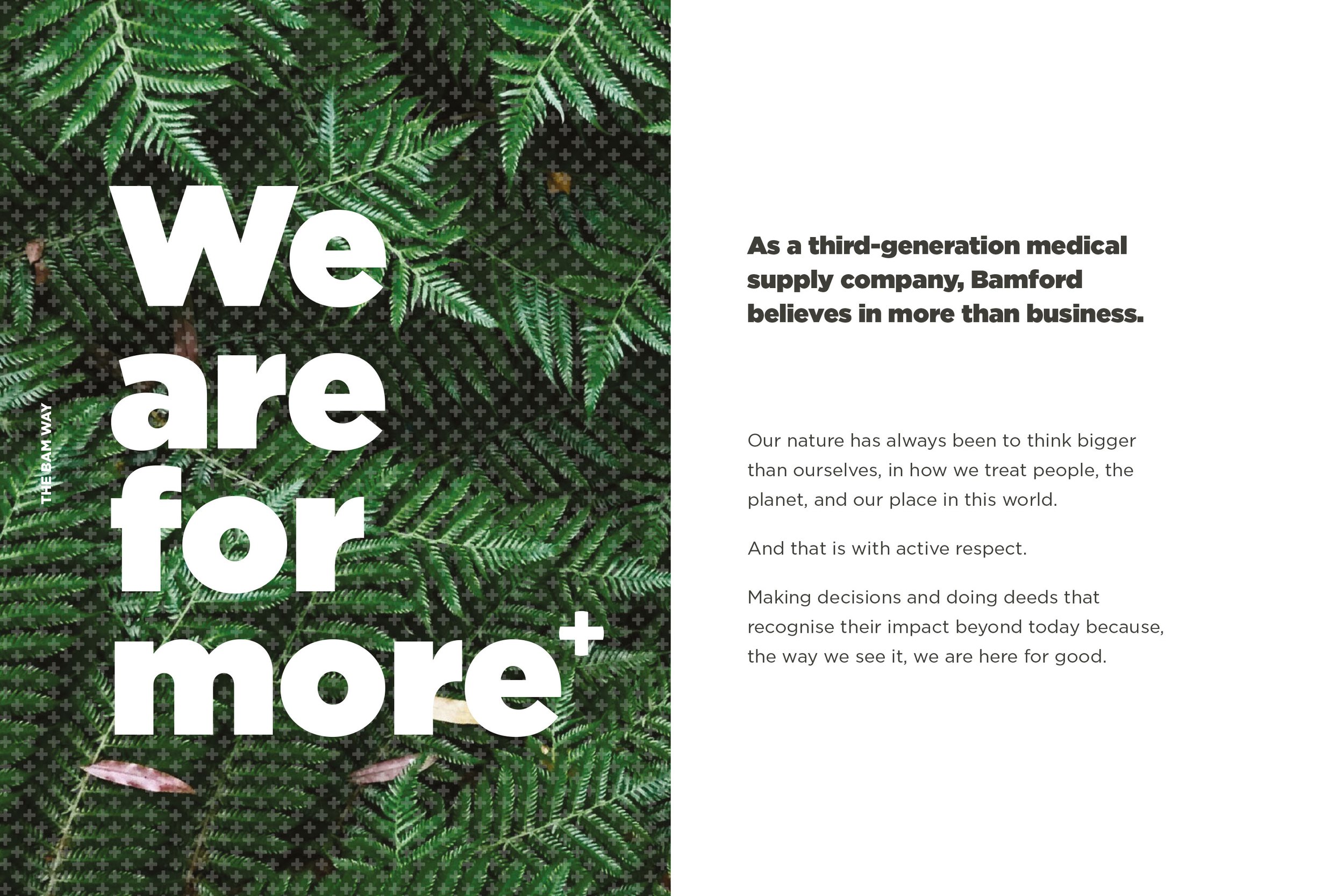
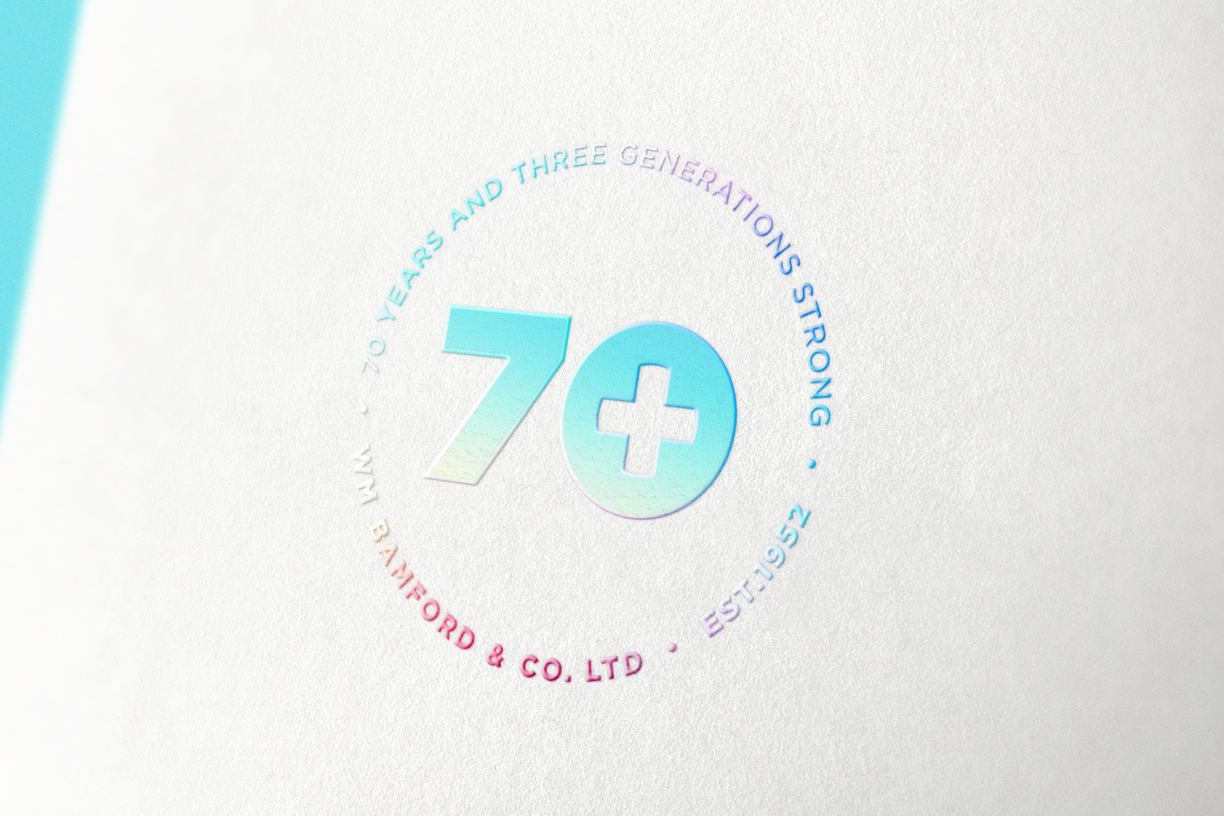

70 years of reliably supplying to the medical sector is an impressive legacy. Three generations in, Bamford sought a brand re-fresh. A gradual re-launch to market required a brand strategy, a brand identity, a brand voice, and a new website. While honouring it’s heritage Bamford looks to it’s future where it continues to place people first with care.
The first step was a brand audit; taking a close look at where the Bamford brand was at, the reasons for it’s being and what direction we could take it in to succeed further while honouring it’s legacy.
A full brand story including elevator pitch, back story and a ‘one-liner’ were developed to help steer communications and give the team a clear focus when engaging with stakeholders.
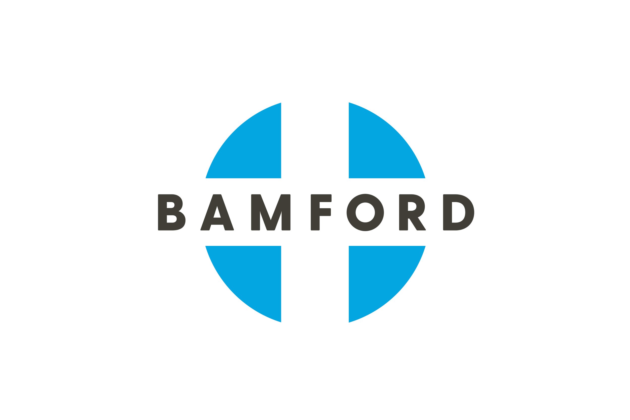
Supporting the brand visually, the logo allowed for subtle adjustments; centralised alignment, a clean and elegant font and a refined colour scheme all helped keep the familiar bones but with a new skin to usher in a new era.
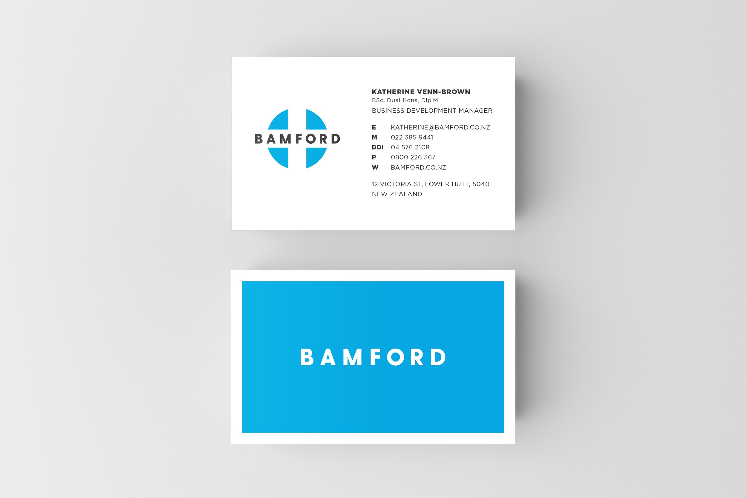
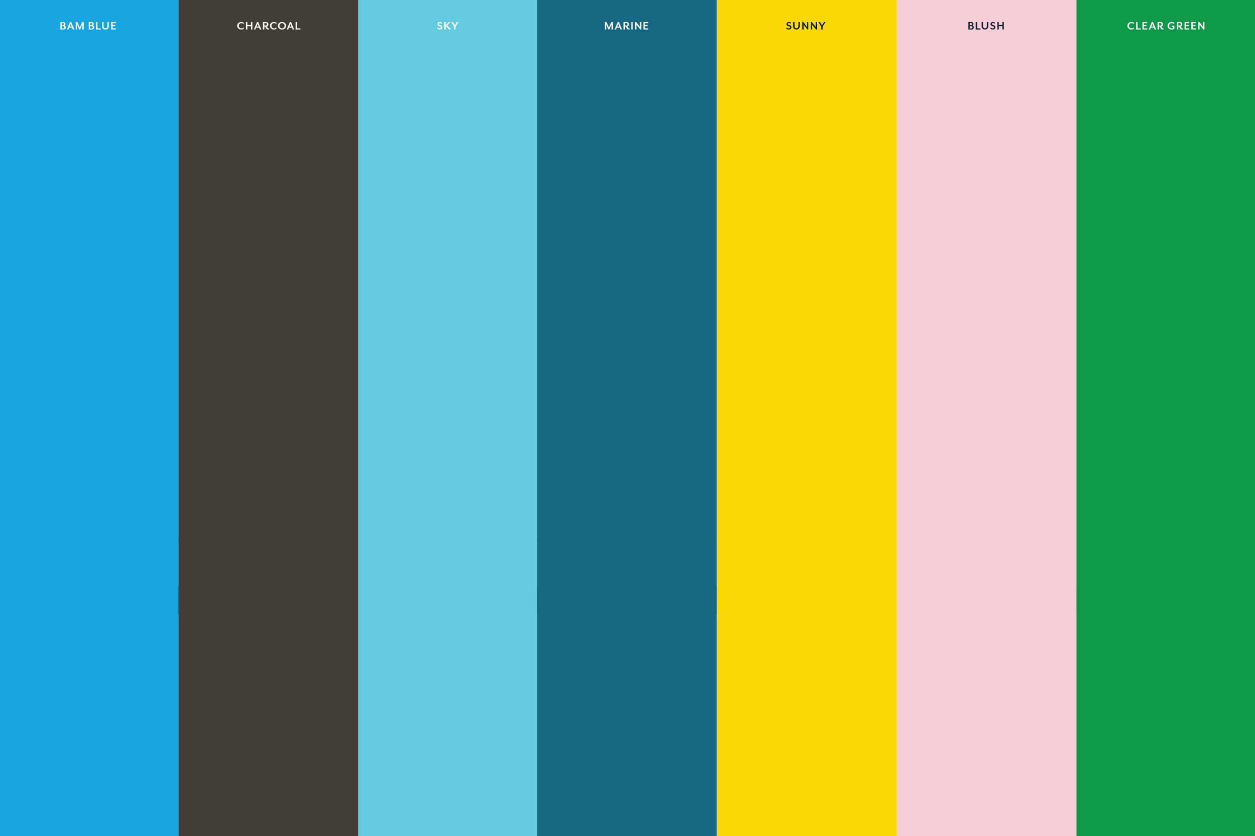
A new colour scheme was essential to support the brand’s goal. A primary palette made of two fresh blues with a softer charcoal all helped soften the edges of the brand and make it feel more approachable. A secondary palette of four supporting hues make for a fully rounded out brand personality, but to be used sparingly and sensitively.
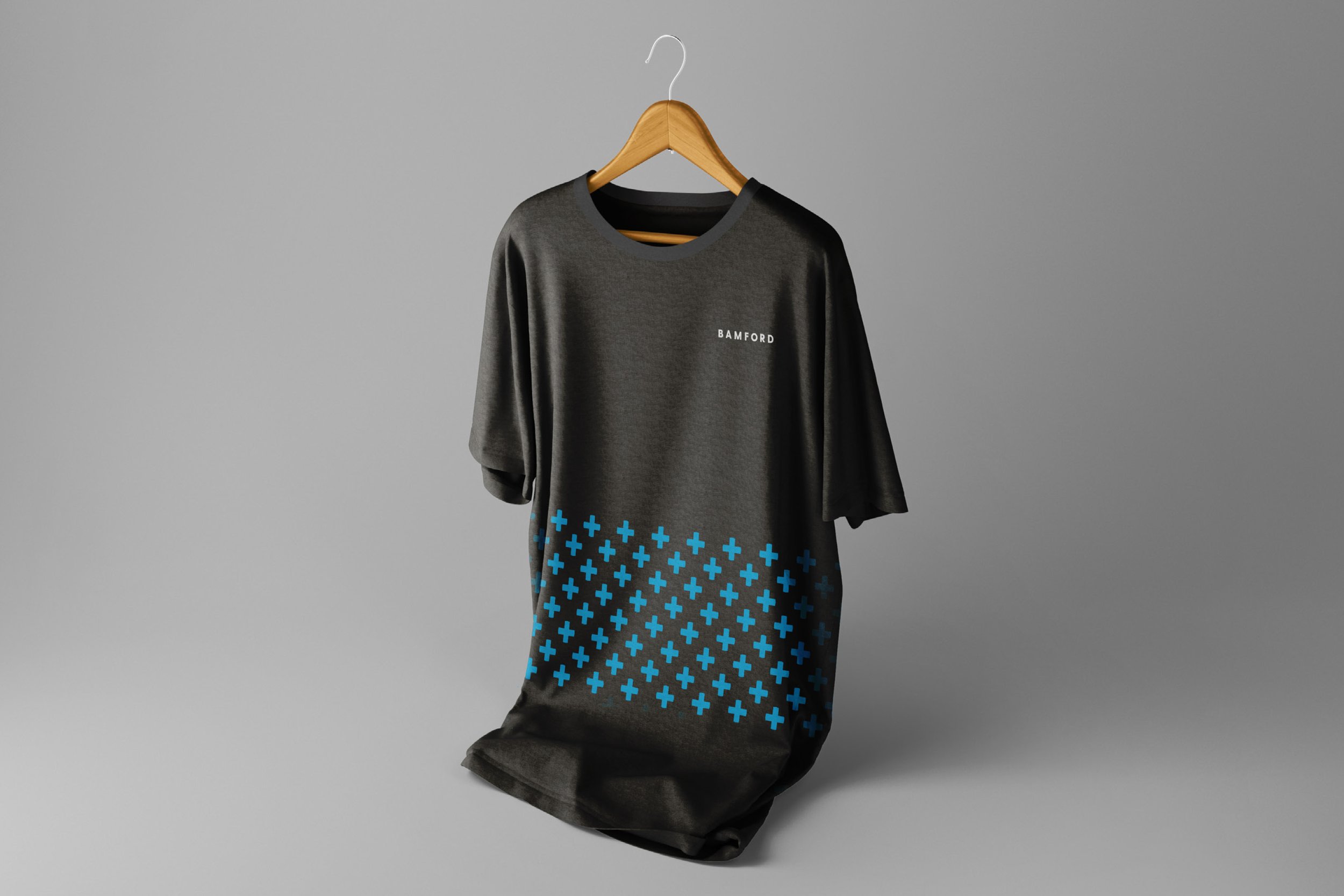
Strong block colours can be broken up by a ‘cross’ pattern. Used small or at large scale, the cross pattern adds movement and interest to catalogue covers and can also be used as an overlay texture in photography.
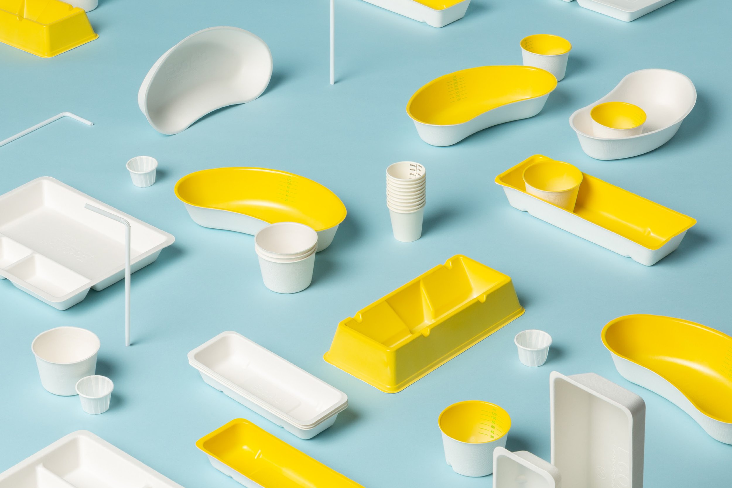
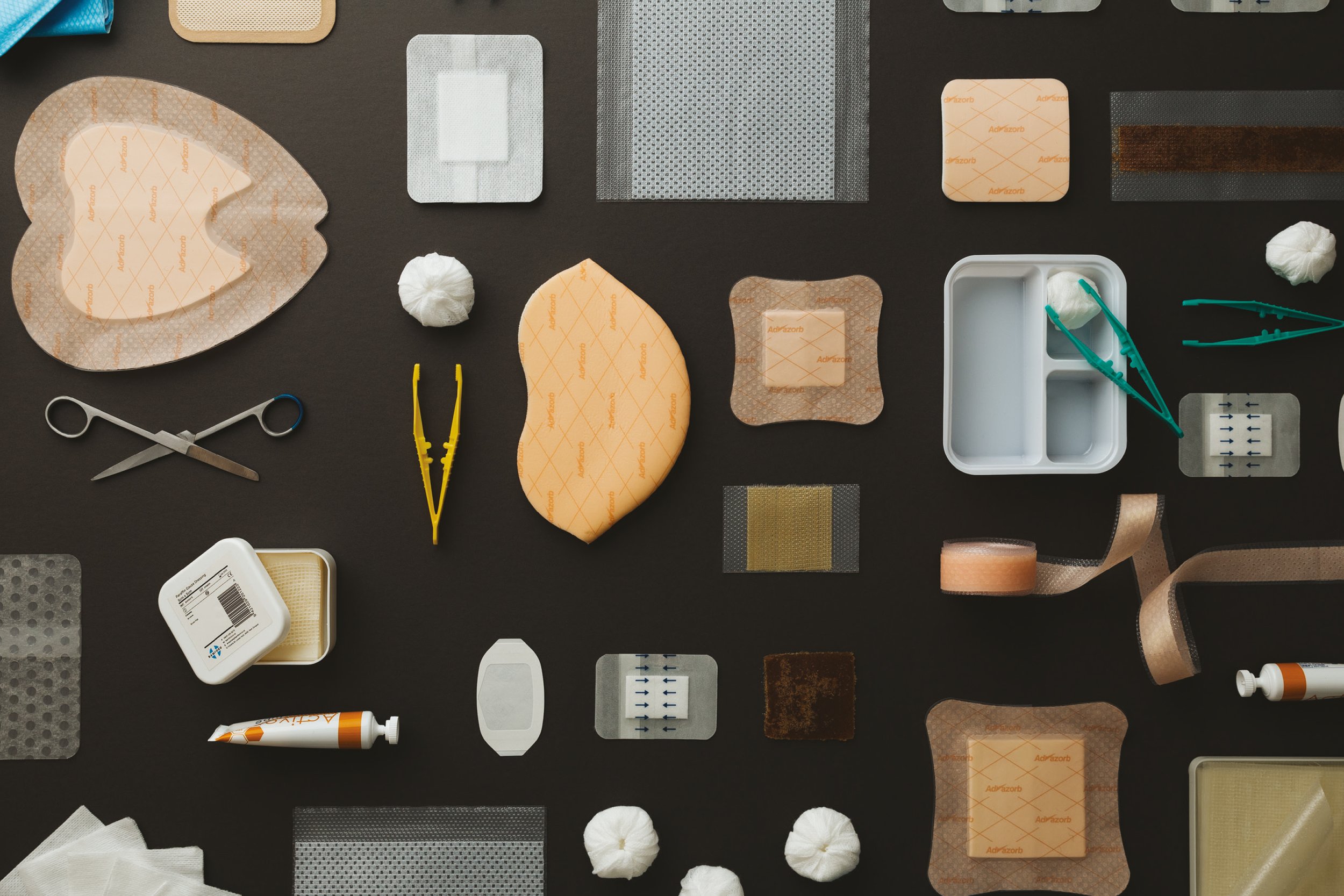
Photography takes the form of factual, specimen-like set-ups that use light and shadow to create ambience. Products are the key focus and unexpected arrangements of these make for a playful imagery.
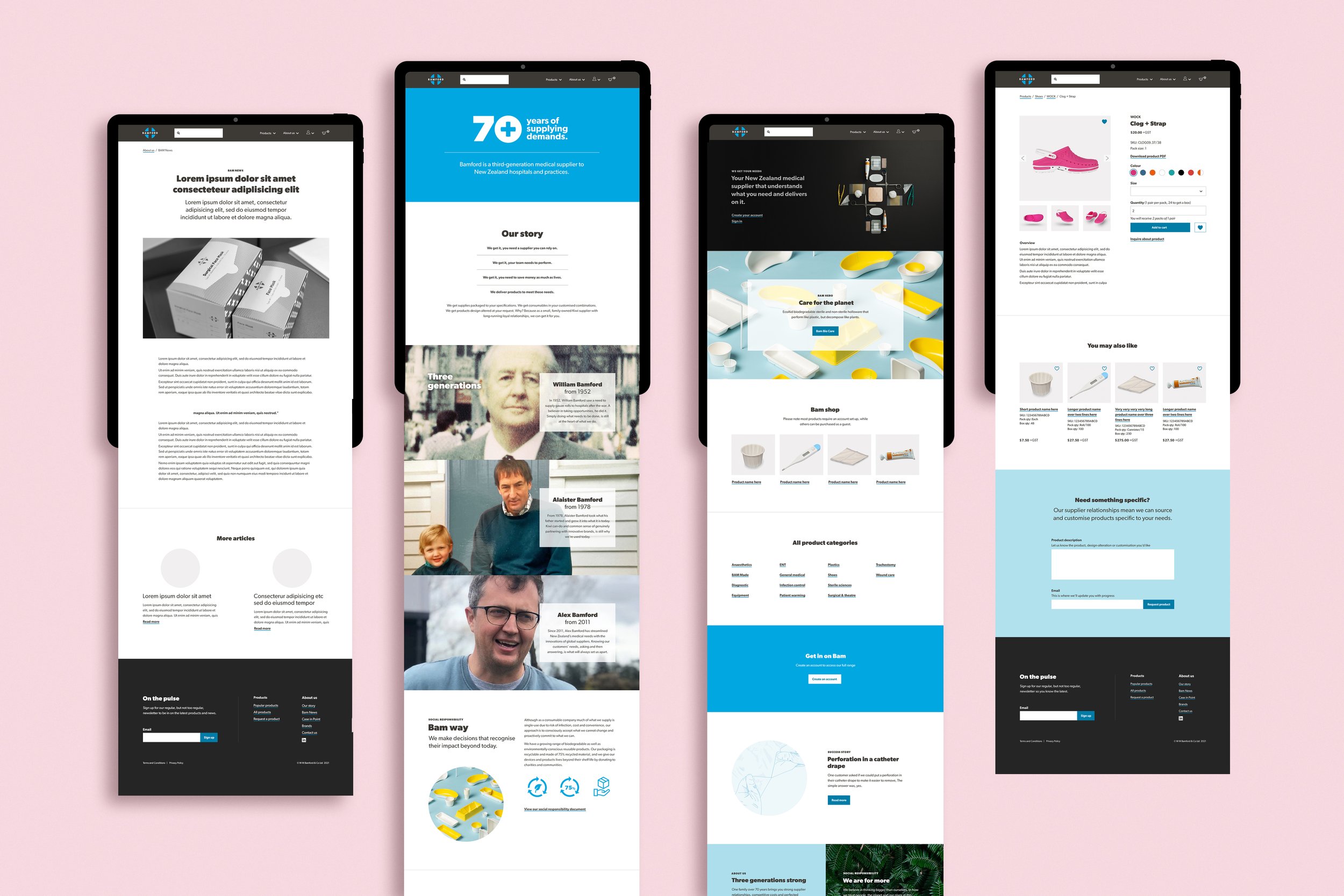
The new logo, colours, patterns photographic and typographic styles have been applied to a variety of collateral and brand communications. Everything from printed business cards and comp slips, packing tape and cartons, product packaging, brochures and books, trade show banners and associated merchandise as well as an e-commerce website have all felt cohesive and of one voice.