2023 is a special year for wāhine in Aotearoa marking 130 years since women fought for, and secured, the right to vote. To commemorate, Manatū Wāhine asked me to develop a symbol that represents the importance and significance of this milestone.

Building upon the success of the ‘Are We There Yet’ identity created for the National Library, the Suffrage 130 identity is part of this established visual language, following the same aesthetic and goal; Unifying women and propelling them forward with a modern tone.
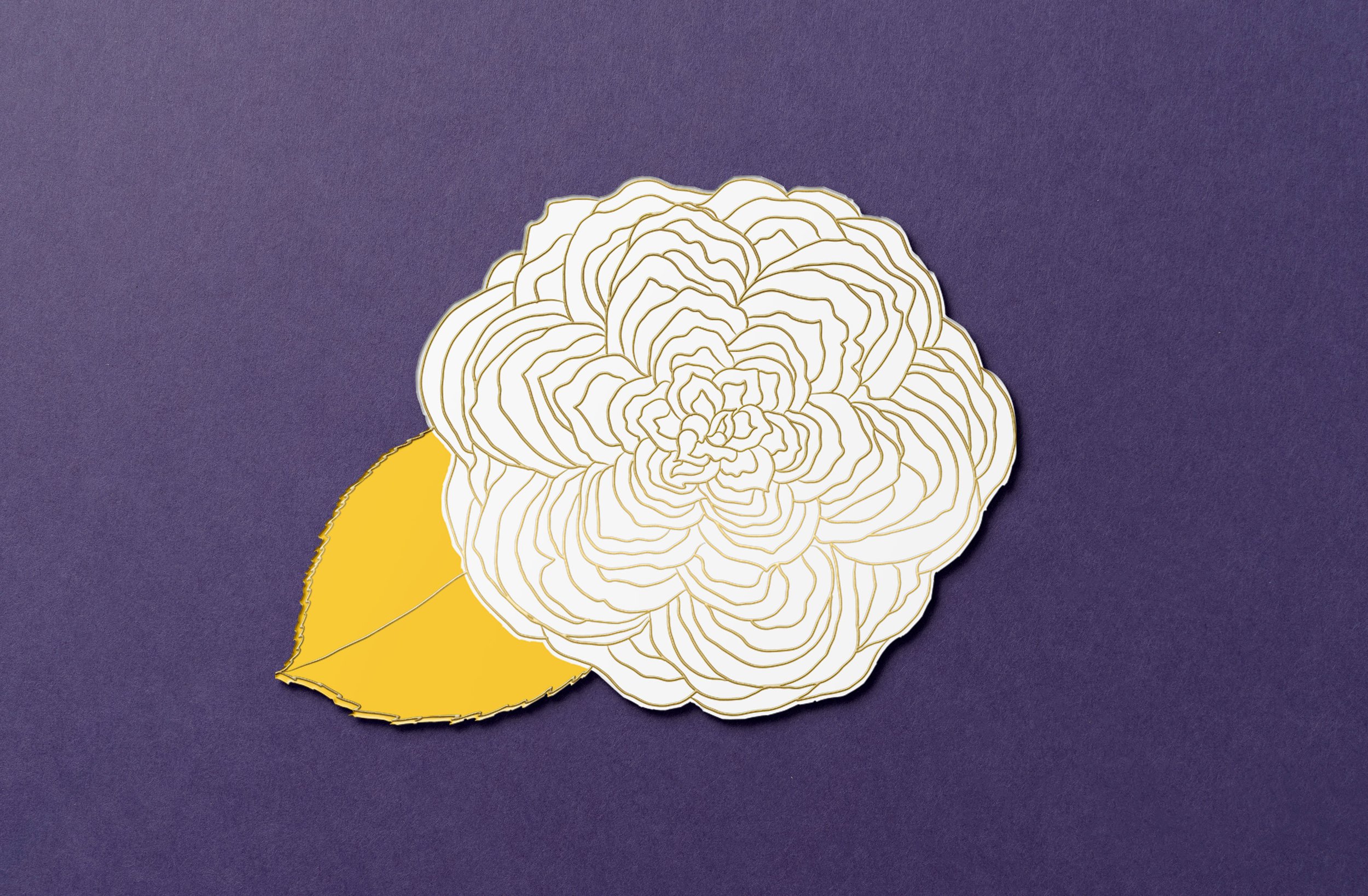
The white camellia is synonymous with the New Zealand women’s suffrage movement and has been chosen to highlight as the key visual for 130 year celebrations. It is iconic in it’s shape and meaning. Suffragists gave them to their parliamentary supporters to wear in the house and it is a tradition that continues year upon year. The challenge was to see how we could extend the camellia’s evocative story in our history and modernise it’s symbolism and place in our visual language for women today.
The identity design shows the camellia in full bloom. We are struck by a multitude of petals – more than usual as this is a very special specimen ... 130 petals in total; One for every year since the Electoral Act was signed into law in 1893, moving Aotearoa New Zealand forward to become the first self-governing country to enshrine in law the right of women to vote in parliamentary elections.
Each and every year is celebrated and commemorated in this piece as each year is important in our collective journey. Each petal is a pause to acknowledge the contributions of the suffragists who fought for this right and the betterment of our society from day one, and every woman thereafter who has made impact each and every year to now. This concept is inclusive in it’s symbolism.
Every element in this composition is carefully hand drawn using a simple and confident style. The rawness of this hand drawn style is key in conveying how emotionally charged the movement and cause remains, even 130 years later. Rather than being a perfectly symmetrical rendition with seamless gradients of colour, like you may see in a corporate identity or communications piece, the appearance is uniquely human and relatable in it’s imperfection.
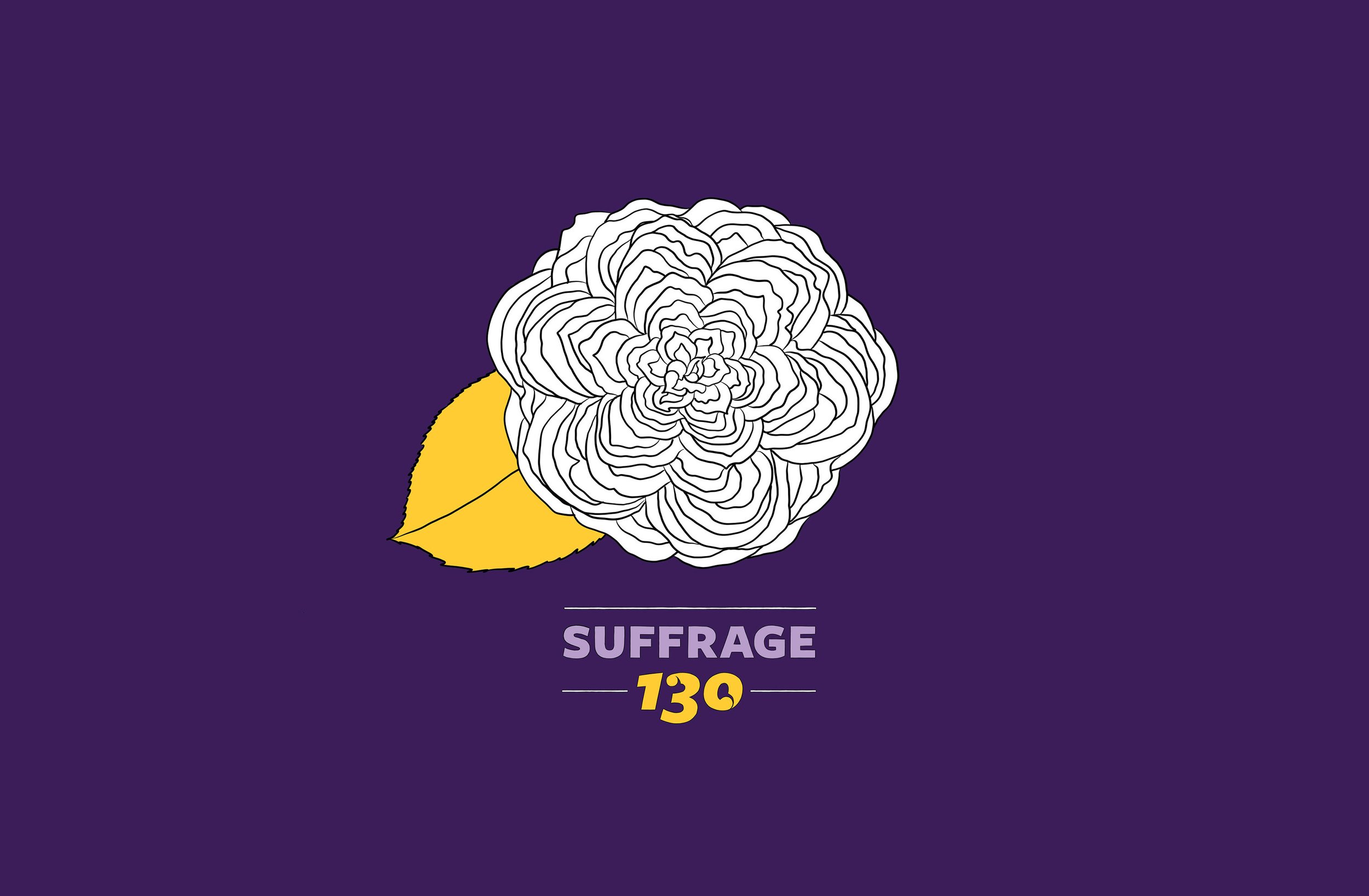
A reduced and elegant colour palette makes for striking impact. The strong and deep purple synonymous with the Suffrage movement is offset by a softer mauve and yellow/gold and of course white for the flower itself.
Finally, the type treatment for ‘Suffrage 130’ is again completely hand drawn and customised to feel relevant to Aotearoa. Stylised korus are used to symbolise growth and have been used sparingly in the ‘130’ element only, to amplify it’s importance.
This symbol isn't about perfection; it's about humanity, relatability, and progress. Just like the journey towards equality, it's uniquely imperfect, yet incredibly powerful.
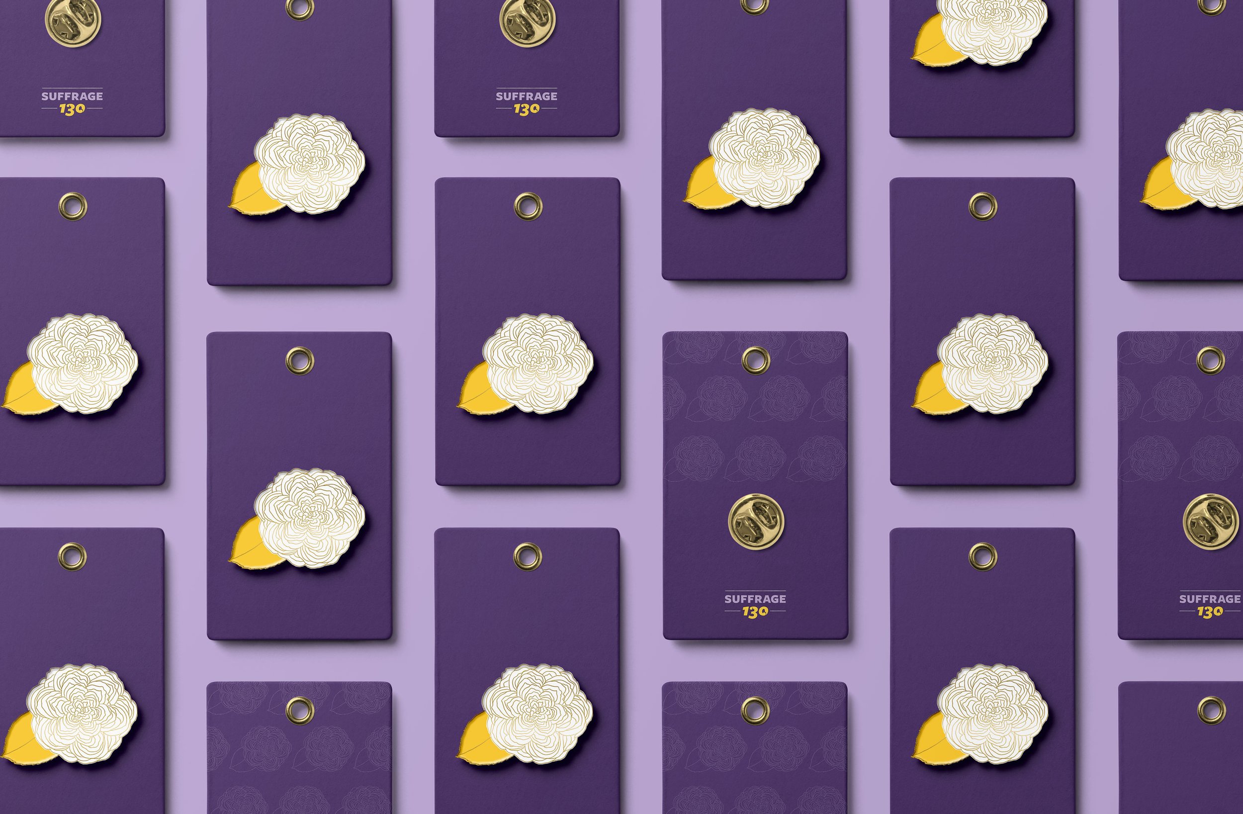
How the identity design translates to lapel pins - concept only.
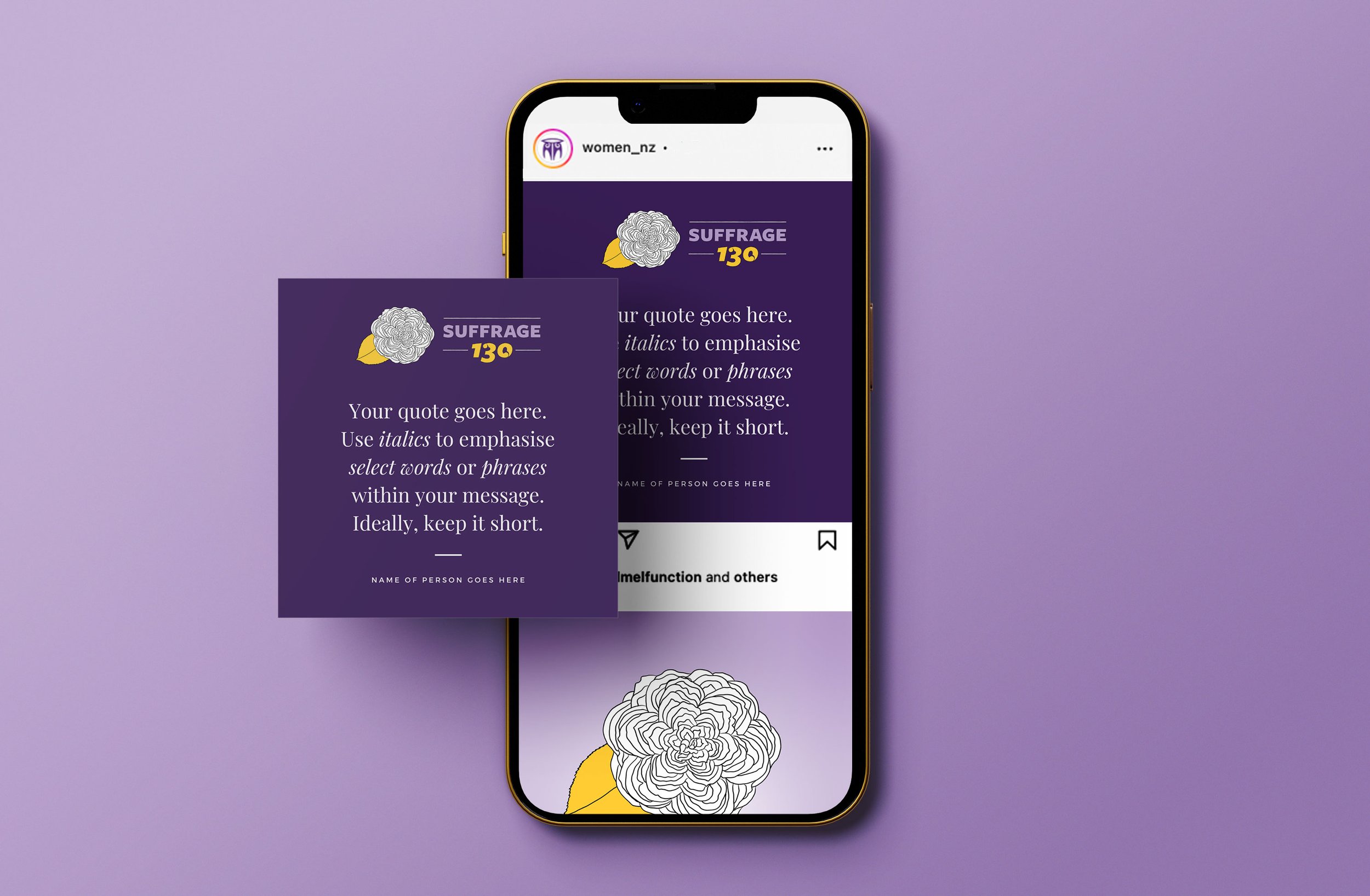
The identity has been applied to a suite of social media templates developed for the in-house comms team at Manatu Wahine to use as needed. It will easily be applied to merchandise, including, possibly, lapel pins for when the Secretary for Women travels, meeting associates.