

Trilogy is globally regarded as the creme de la creme of certified organic skincare. A beautifully minimal brand, the Trilogists sought to keep the simplicity of their online presence while amping-up the energy and vibrancy a couple of notches.
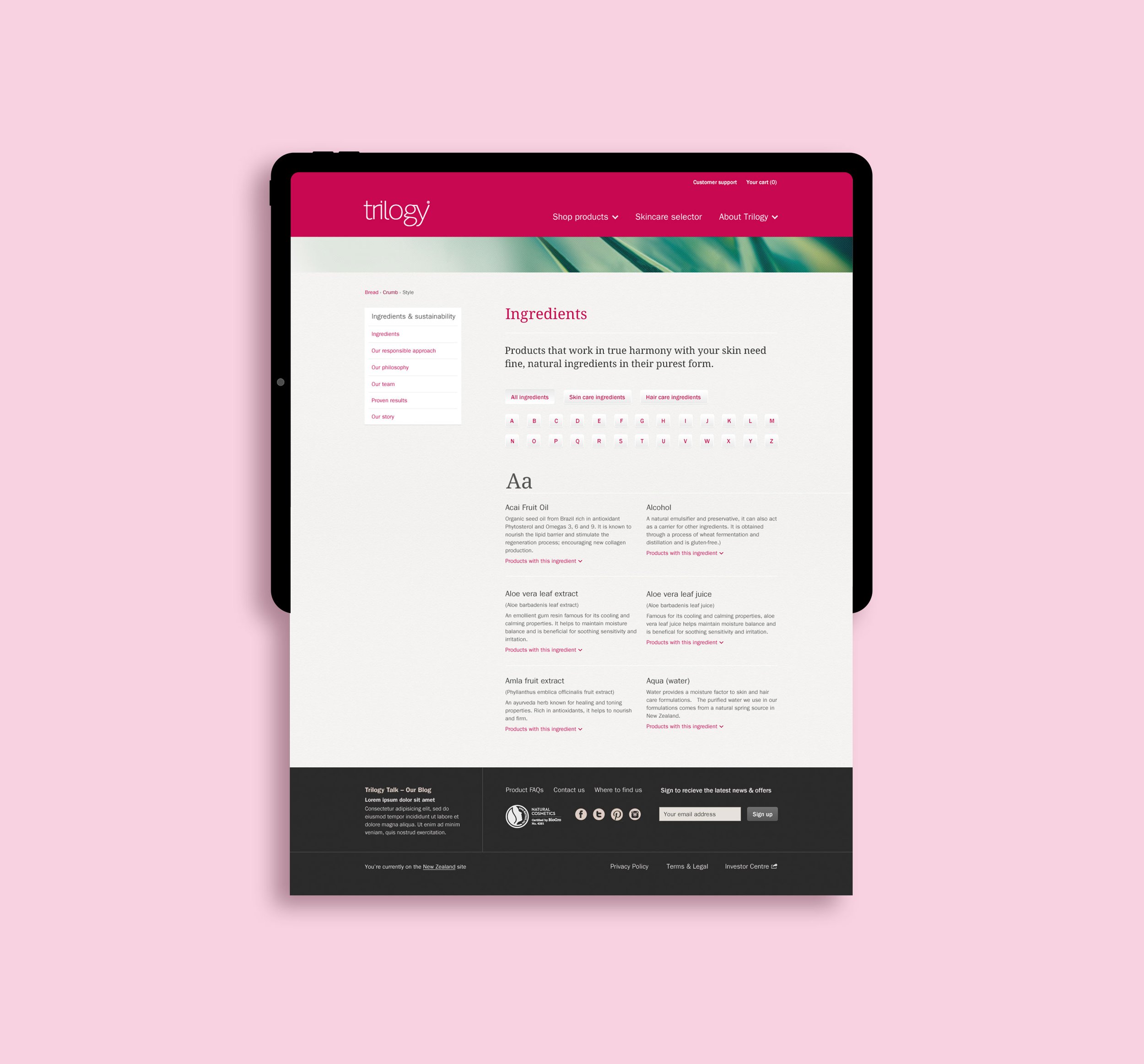
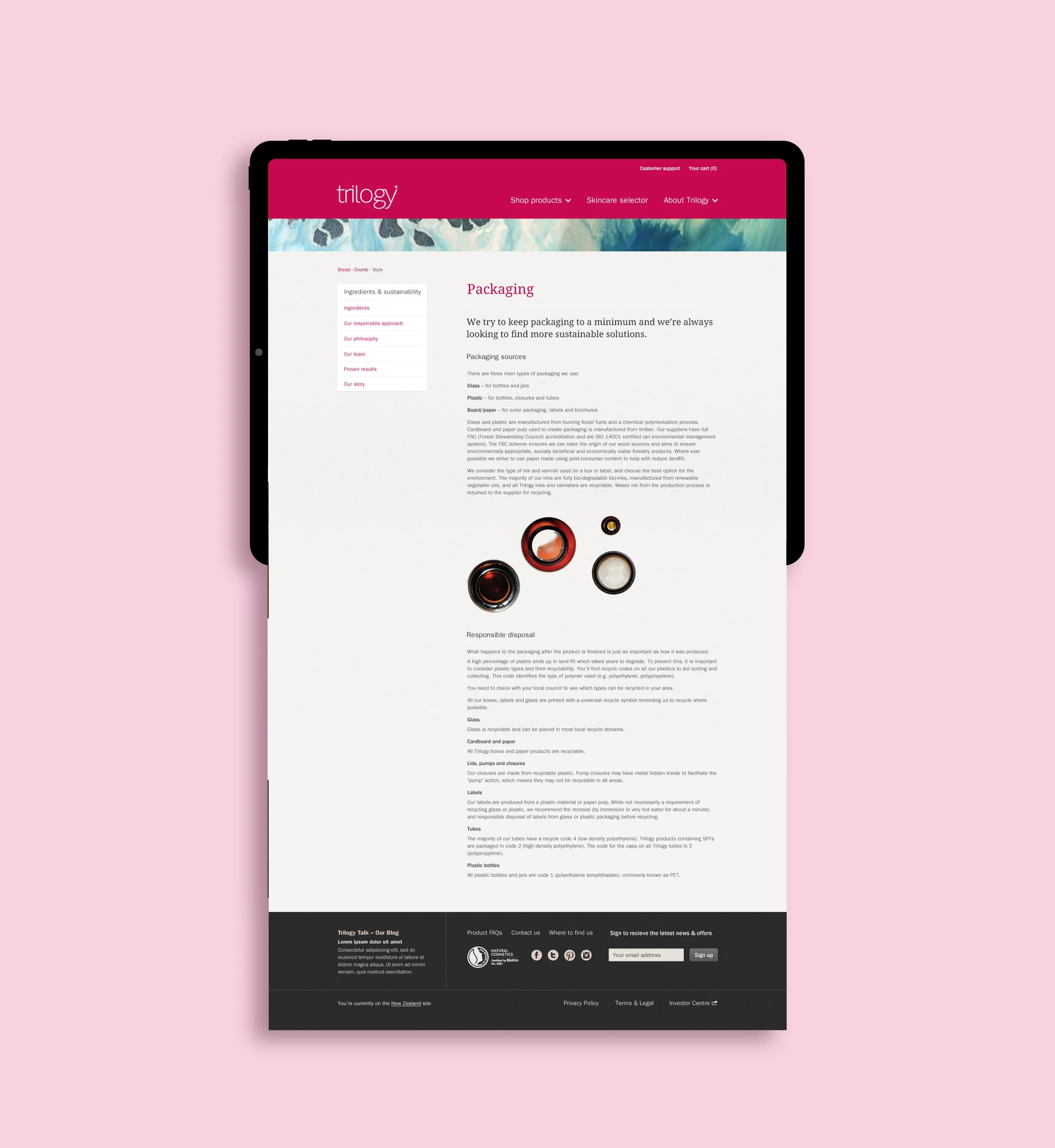
Beginning with a beautifully structured site to build upon, the focus was to find opportunities to add greater sense of dynamics between imagery, clear space and written content that would push the brand further and engage shoppers while keeping the solid ‘bones’.
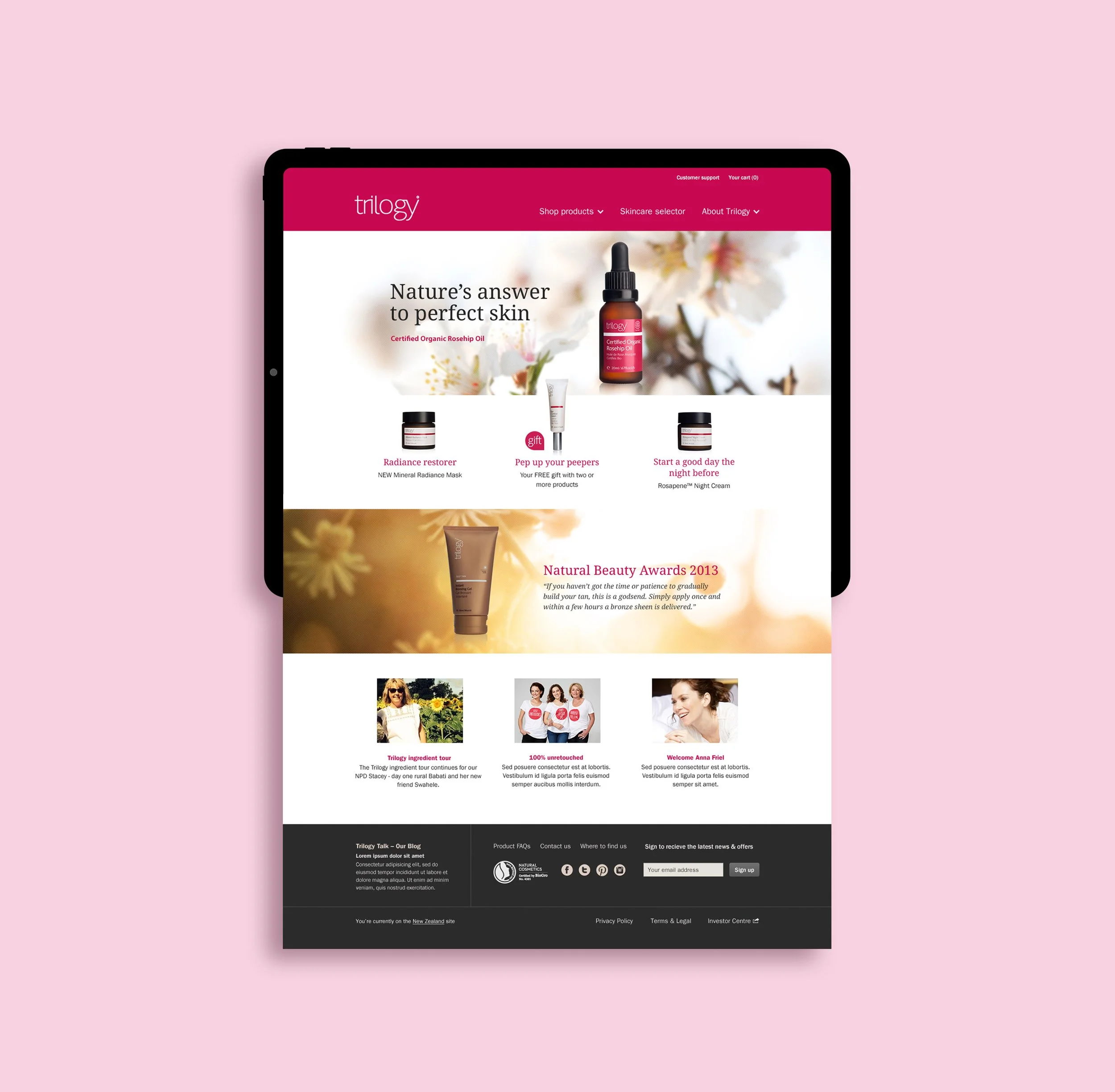
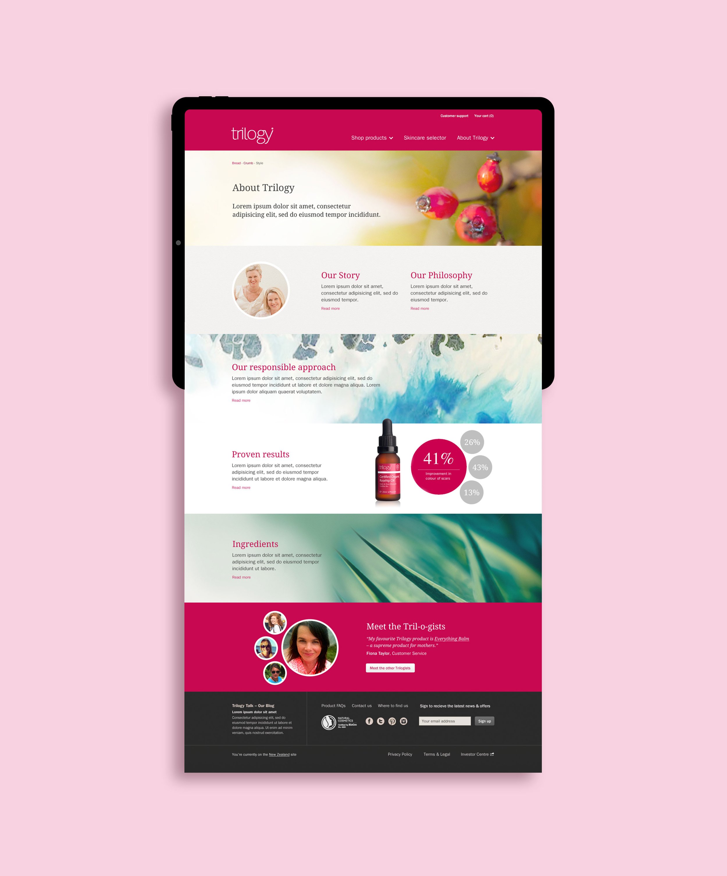
Stunning photography exploring natural textures of plant life, seascapes and key product ingredients, such as the iconic rose hip, were chosen to deepen the brand story and show the product origins.


The photography was defocussed in some areas making for dreamlike vignettes and overlayed with subtle criss-cross texture to add interest. The photography was the perfect compliment to the addition of rich blocks of the Trilogy Red to enliven an otherwise neutral palette.
The introduction of image slices helped break information up and create pace. The treatment of team profiles and key statistics both used circular shapes to keep the look consistent.
Small touches like deepening the main navigation panel and using flat colour instantly freshened the look while also helping users find what they wanted. With the user experience front of mind, the navigation and drop-down 'mega menu' was carefully considered for mobile to make sure users had the best experience no matter what device they were using.

Collaborators: Heyday