
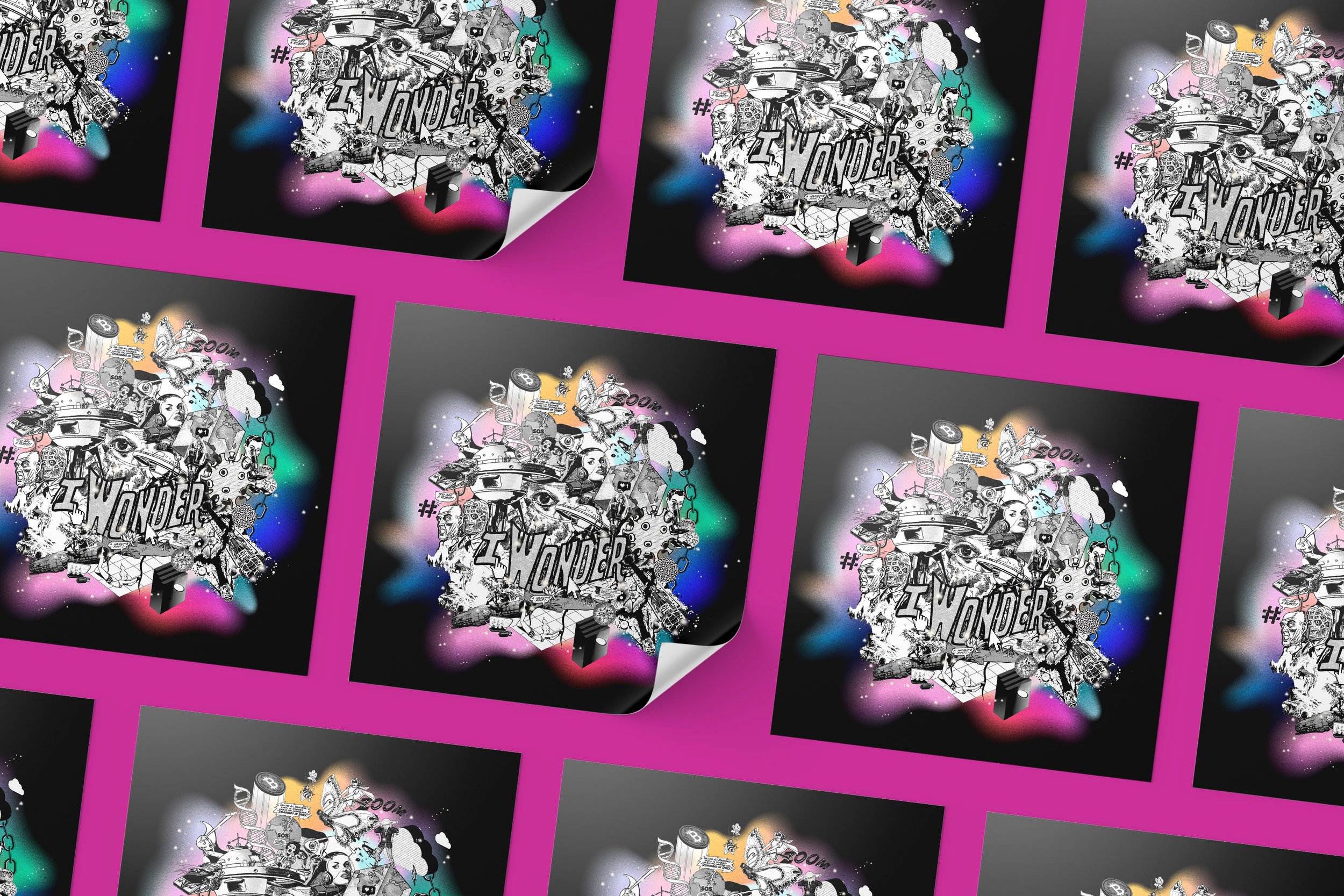
To help launch the new kōrero series, ‘I Wonder’, an identity has been commissioned by the National Library of New Zealand to help explore the what-ifs and maybes of our futures.
This series is where the curious, the innovative, the dreamers, the futurists and radical thinkers can muse the sometimes difficult and always exciting questions about the future of Aotearoa and the planet.
The future has always been an obsession for humanity. The dreams, visions, predictions, hopes and fears for a potential future can be clearly seen in the printed ephemera of previous decades.
The visual vocabulary of vintage comic books, advertisements and social campaigns dating from back to the mid 20th century share compelling situations, characters and stories that have influenced generations. It is from this time that the mass-sharing of ideas began, all due to the invention of the printing press – enabling the development and mass distribution of science fiction along with science ‘facts’, in the form of magazines, comics etc. Therefore the platform to showcase an amazing array of artists and their vision for the future was born. What makes these nostalgic pieces so fascinating today is they still hold true to some of our ideas and ideals of the future, some 50 years on.
The genre’s influence over current media narratives is still clear. Glimpses of future cities made of concrete and glass, space craft design, encounters with alien life, space exploration, fears of the world being over, humanity’s extinction, technological achievement and the enormous focus on how science can be harnessed for good (and evil) are all major themes in the wonderings and conversations we have of ‘the future’ - then and now, through both dystopian and utopian lenses.
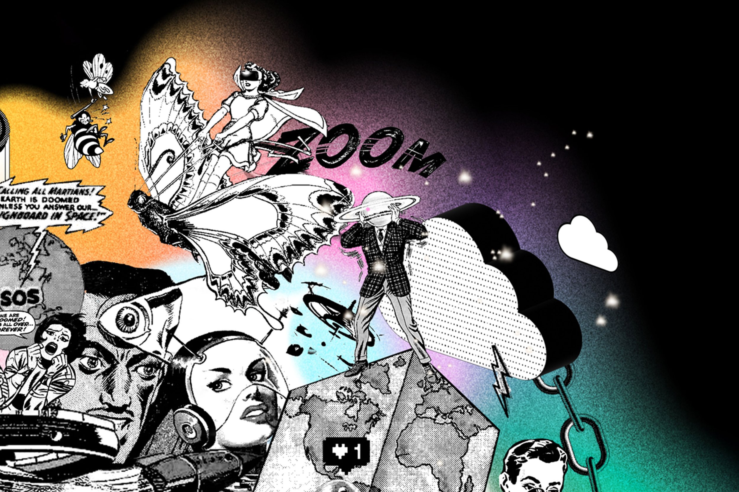
Glorious illustrations from this ‘golden era’ of communication have been remixed and juxtaposed with iconography of modern life (hashtags, ‘likes’ among the selection). This provides many possible musings for our current radical thinkers.
The idea of ‘reusing’ or ‘recycling’ existing material is metaphorically en pointe as contemporary society struggles to process the sheer output of humanity to date. Instead of creating more, let’s reuse what we have ‘on archive’ to create a contemporary conversation/commentary.
The ‘I Wonder’ identity has been designed to amuse and provoke the imagination. Steeped in fantasy the identity aims to act as an ‘icebreaker’ of sorts - allowing manuhiri to relax and engage with the speakers and the content.
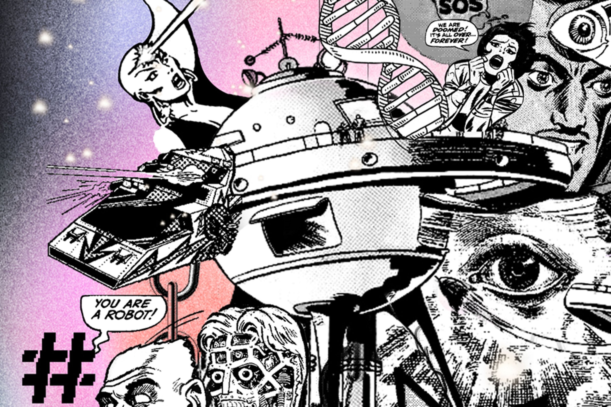
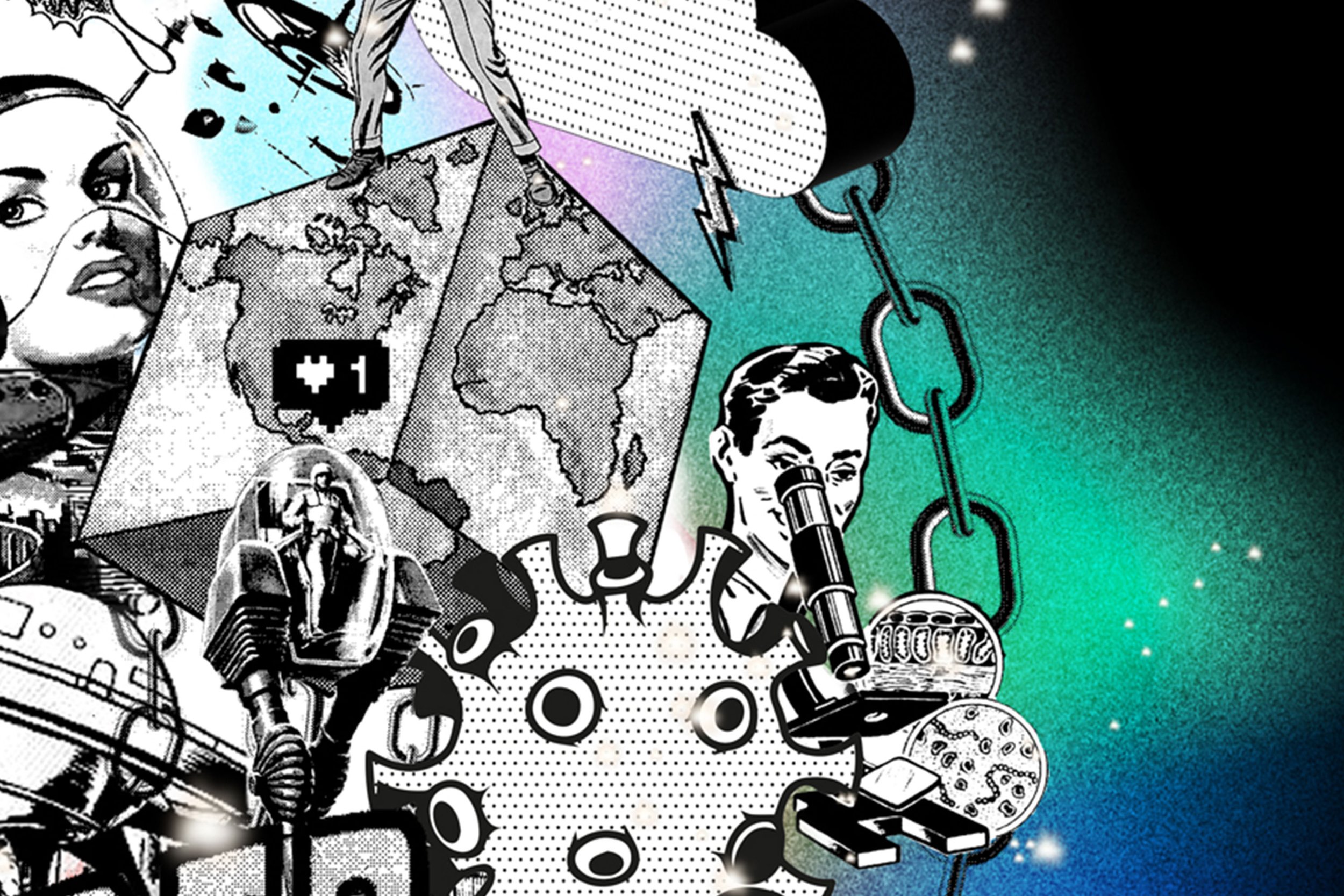
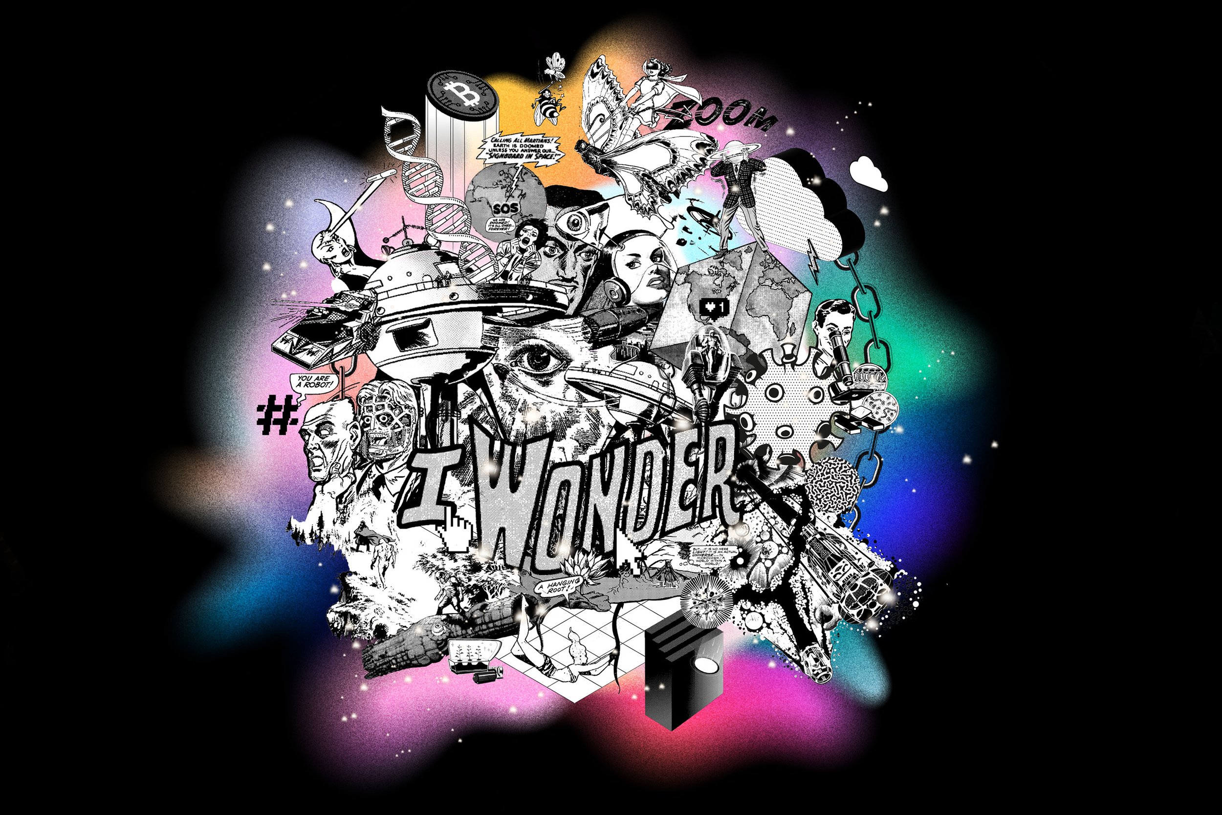
A fantastical mix of objects, characters and environments sourced from vintage comics and magazines is introduced to us in an unfathomable, remixed composition.
The composition shows space exploration and time travel, extra-terrestrial communication, artificial intelligence (robotics), virtual/augmented reality technology, cryptocurrencies, climate catastrophes, superbugs and medicine, resource extraction and of course the end of the universe.
Artificial intelligence has been a prominent theme in science fiction. Robotics that look ‘real’ are becoming more and more possible in terms of appearance and behaviour. How does this alter the value of human life?
The examination of superbugs, bacteria and the development of new medicines is and will continue to be crucial to society. This is also referenced here with microscopes, bacterial textures including Covid.
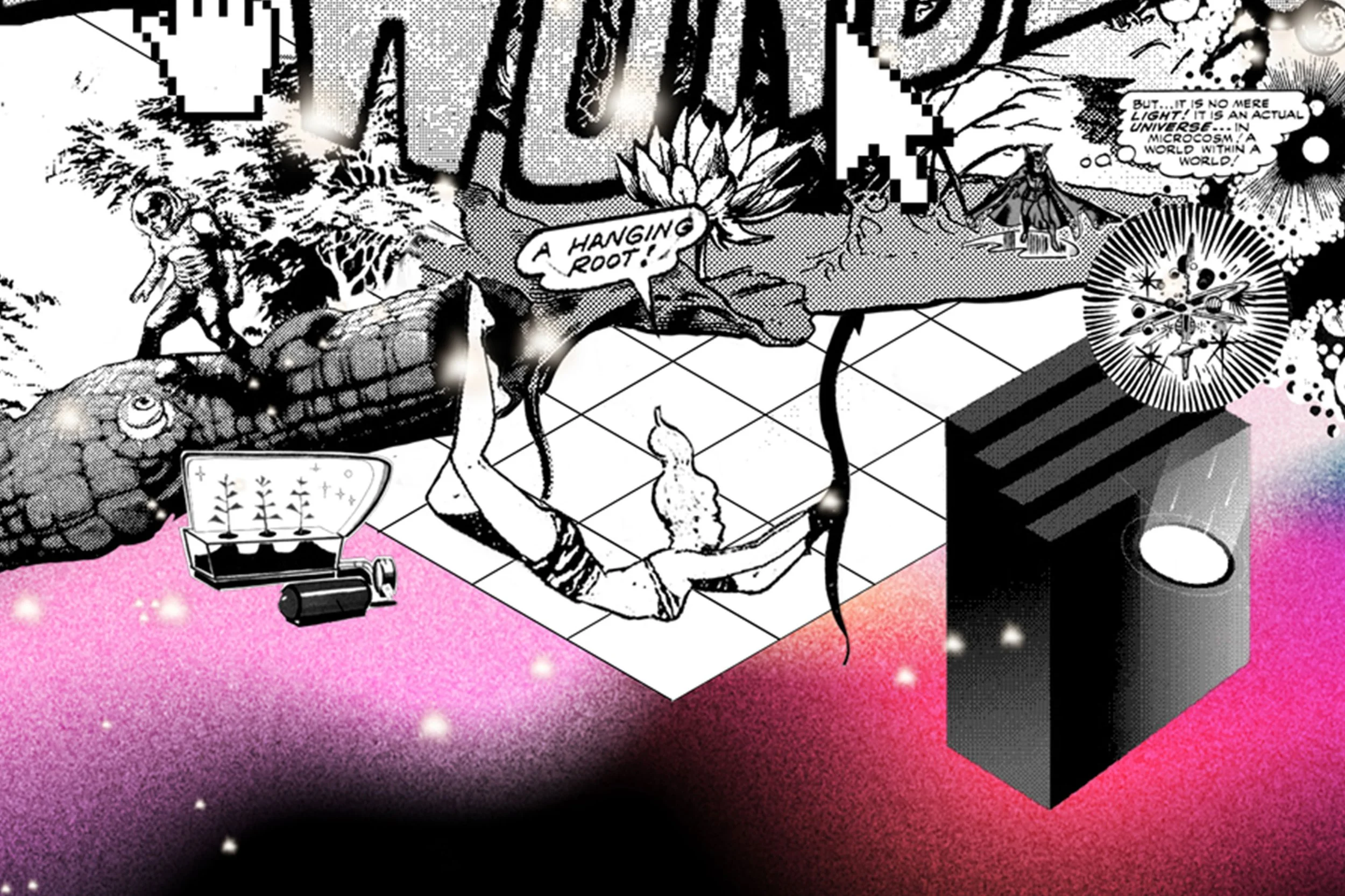
A futuristic city scape sits centrally to the design and is offset with a mountainous terrain on the left and swamps and trees below. I wonder how nature will survive man? A figure acrobatically swinging from a tree root is a metaphor for us holding on to life on earth ... it can be perilous but we must hang on. We see plant specimens have been extracted and carefully planted into a capsule floating into space ... mankind’s effort to preserve our natural resources and potentially use on another world... I wonder?
This imagery is collaged and shown in black and white to create a cohesive look for the scene. However, to help amplify the sense of wonder, strong and evocative swathes of dream-like ambient colour have been brought in to anchor and give energy to the composition.
These swathes of colour have a dotted ‘grain’ effect applied to them, harking back to the era of vintage magazine and newspaper print where the realities and imperfections of the print process shine. In an era of digital perfection, these gritty layers enable the identity to feel accessible and somehow relatable.
A dusting of celestial stars have been dotted around as the wonderous finishing touch. This subtle texture give the design an extra ‘something- special’, glittering thoughts in open minds.