

Bird Island is a leader in innovation; nurturing talent and creative ideas. Known for serious expertise with a vivacious edge, founder and director, Tui Te Hau sought a compelling vision for the brand to inspire and foster good social change.
Bird Island expertly provides consulting, support and inspiration to entrepreneurs and start-ups within the tech, innovation and culture ecosystem, globally. Built up from over 20 years of experience in the sector clients come to Tui and Bird Island because of her solid reputation and charismatic delivery of talks, workshops and one-on-one mentor sessions. Taking flight and launching the Bird Island brand into market required a deliberate and bespoke response.
Tui sought a brand that is a true reflection of her personal style and approach to her mahi. A ‘wish list’ of colours and objects made it’s way into a striking ‘hero image’ to use across all marketing comms to transport Tui’s partners and clients to the Bird Island energy. Along with this hero image a brand kit detailing a word mark, brand stamp and full colour palette was crafted to work in harmony.
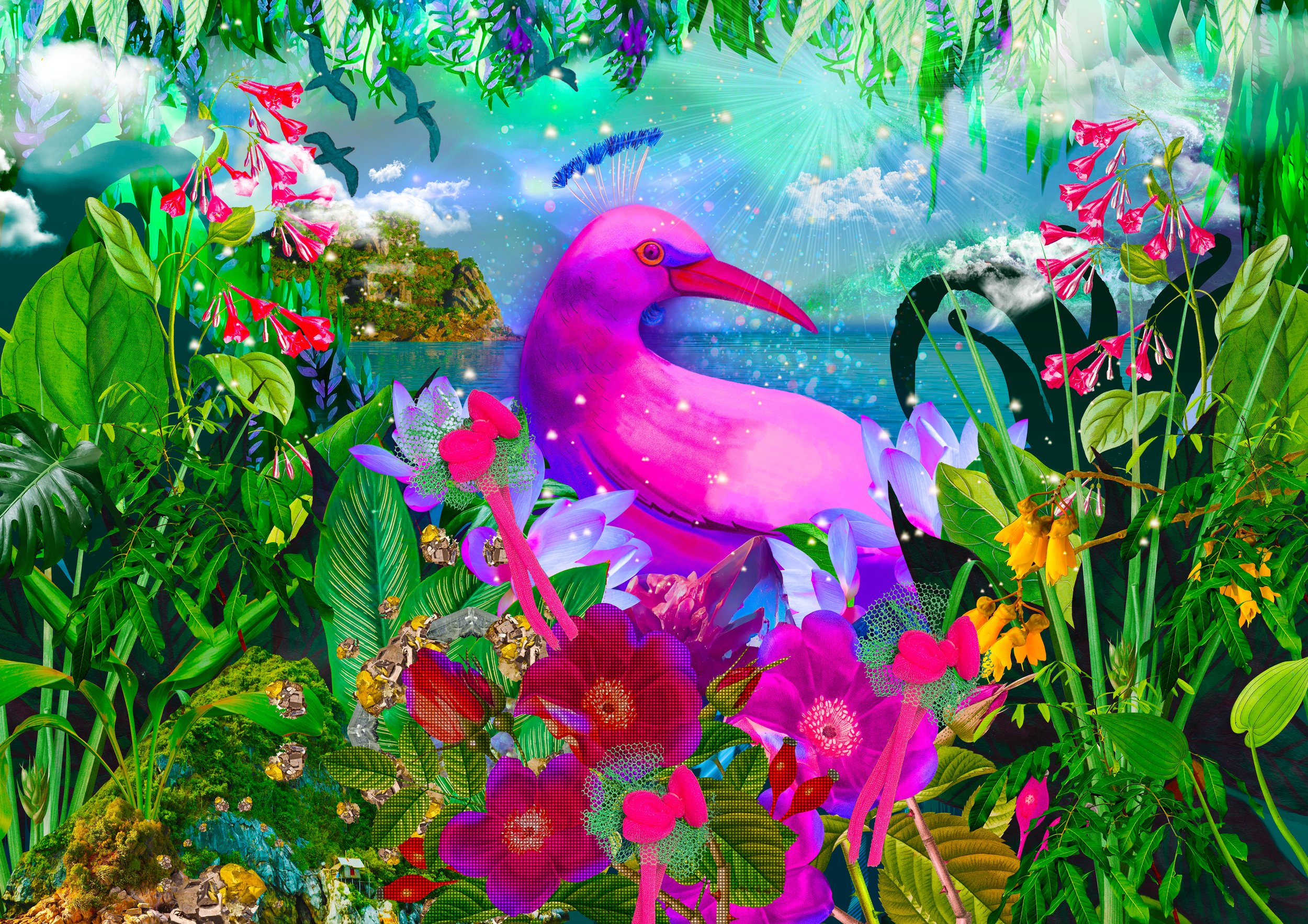
HERO IMAGE
A mix of hand-drawn and hand-painted elements are combined with photographs, computer generated renderings and digital paint and scans of real fabric elements are woven in together to create a new world – a combination of old and new tech, remixed to make something unique to Bird Island. Within the image we see a lush scene of nature in full bloom. This lush wonderland of course is ‘Bird Island’ – a place made of strength, courage, creativity, love and vision.
It is also the home to our ‘Tui 2.0’ bird. Tui 2.0 is a new species, evolved via the process of natural selection – survival through tumultuous environmental conditions – fine-tuned DNA of a natural leader.
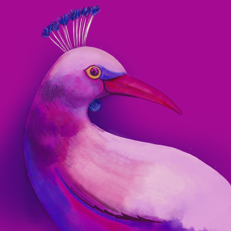
The bird ‘s design takes inspiration from many others; tuis, peacocks and huia.
Leaves of every shape and size come together in harmony, interweaving, nest-like, frame the scene. A single kōwhai branch extends through (an acknowledgement to the island being able to sustain the bird’s life through feasting on it’s nectar). Natural stones, namely Amethyst and Pyrite are dotted through for their symbolism. Calm waters on the horizon because this is a safe place. Clouds float through a celestial sky dotted with stars and an impressive sunburst. The future is bright!
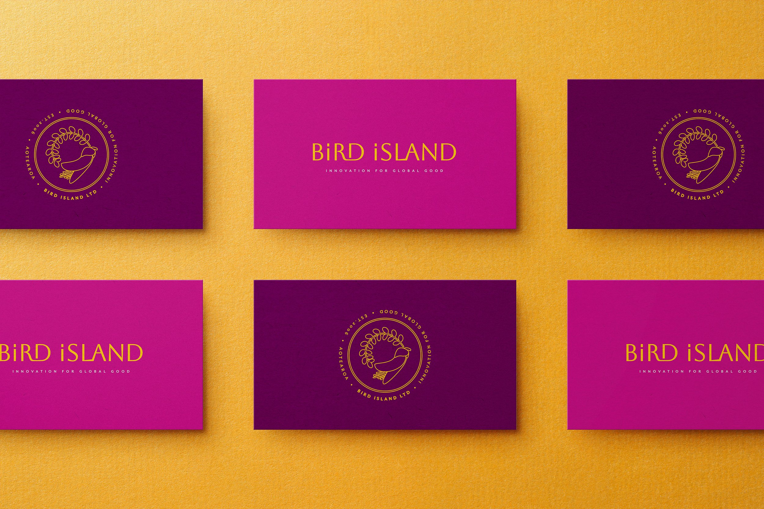
WORD MARK AND BRAND STAMP
The Bird Island logo wordmark is refined and plays to a quieter tone to balance the high-energy of the hero image. Less of a riot and more of a calmer confidence. It’s letter forms are made of thick and thins that are human and approachable but daringly elegant and modern.
A brand stamp has been created as a secondary tool to inject another layer of personality when needed, extending the story of Bird Island. Taking it’s cue from the idea of abundance, life and nature found in the Bird Island hero image, a single kowhai flower and leaf have been chosen to show for their connection to the native Tui of Aotearoa as a key life source in its environment.
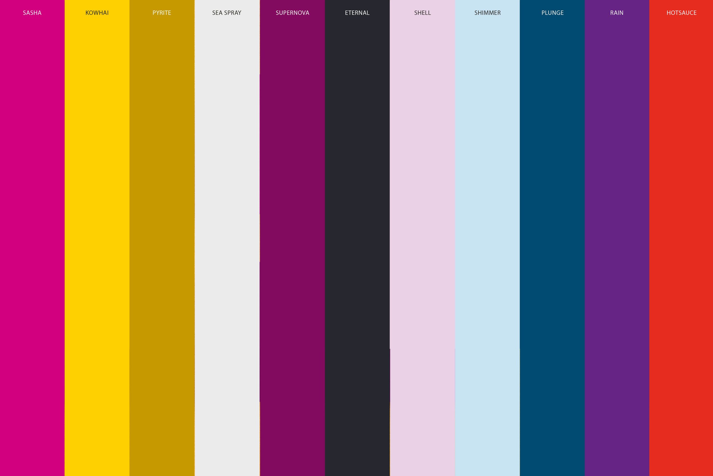
The colour palette is a collection of carefully chosen hues that have energy while rooted in maturity. Intense pinks (‘Sasha’ and ‘Supernova’), yellows (‘Kowhai’) and golds (‘Pyrite’) are the heroes, along with an almost black (‘Eternal’) and the softest grey (‘Sea Spray’). The supporting colours can be used to build out the brand across various communications; Bold purple (‘Rain’) and deep turquoise (‘Plunge’) sit well with a spicy orange (‘Hot Sauce’) and are offset by paler tones of soft blue (‘Shimmer’) and soft pink (‘Shell’).