

The E Oho korero/talk series, brought to you by the National Library of New Zealand, aims to lay the foundation for all people living in Aotearoa by exploring key events that shaped the nation we call home. It’s a series for everyone.
To help launch E Oho an identity has been developed to inspire the concept of ‘arising’ or ‘rising up’. As a nation we must be compelled to shed light on the events of our past. We must have both eyes open to critically analyse our history in order to understand the contemporary consequences and move forward with common purpose.
Our history, and specifically, the whenua/physical land of Aotearoa is our commonality – the strong threads of our individual stories lived on this land weave their way, join, cross over and become a rich tapestry; the story of Aotearoa.
This identity needed to be broad enough in tone to speak to every New Zealander. It is for them. What connects us all is the precious land of Aotearoa. Our home. Our place. This is the identity’s primary focus.
The visual treatment is kept beautifully simple and evocative. By highlighting the very essence at the heart of the concept (the land, a new day/beginning, our common threads/stories) the identity becomes accessible. It has the opportunity to be interpreted in a variety of ways and to tell a variety of complex stories.
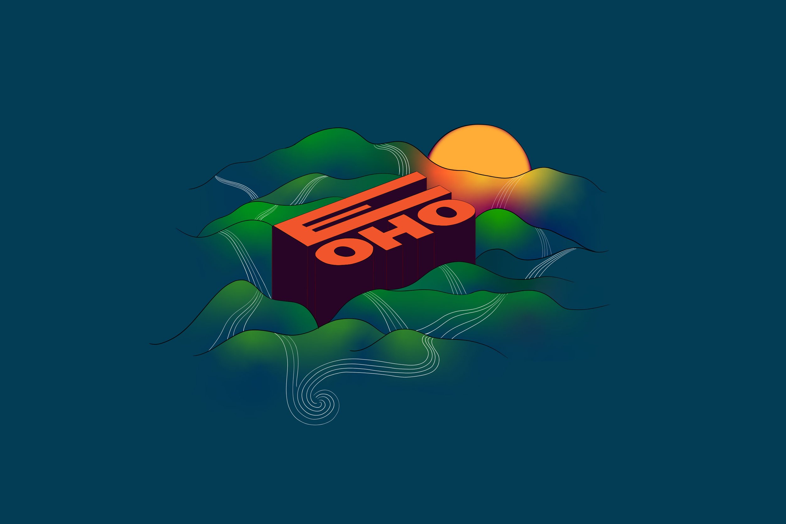
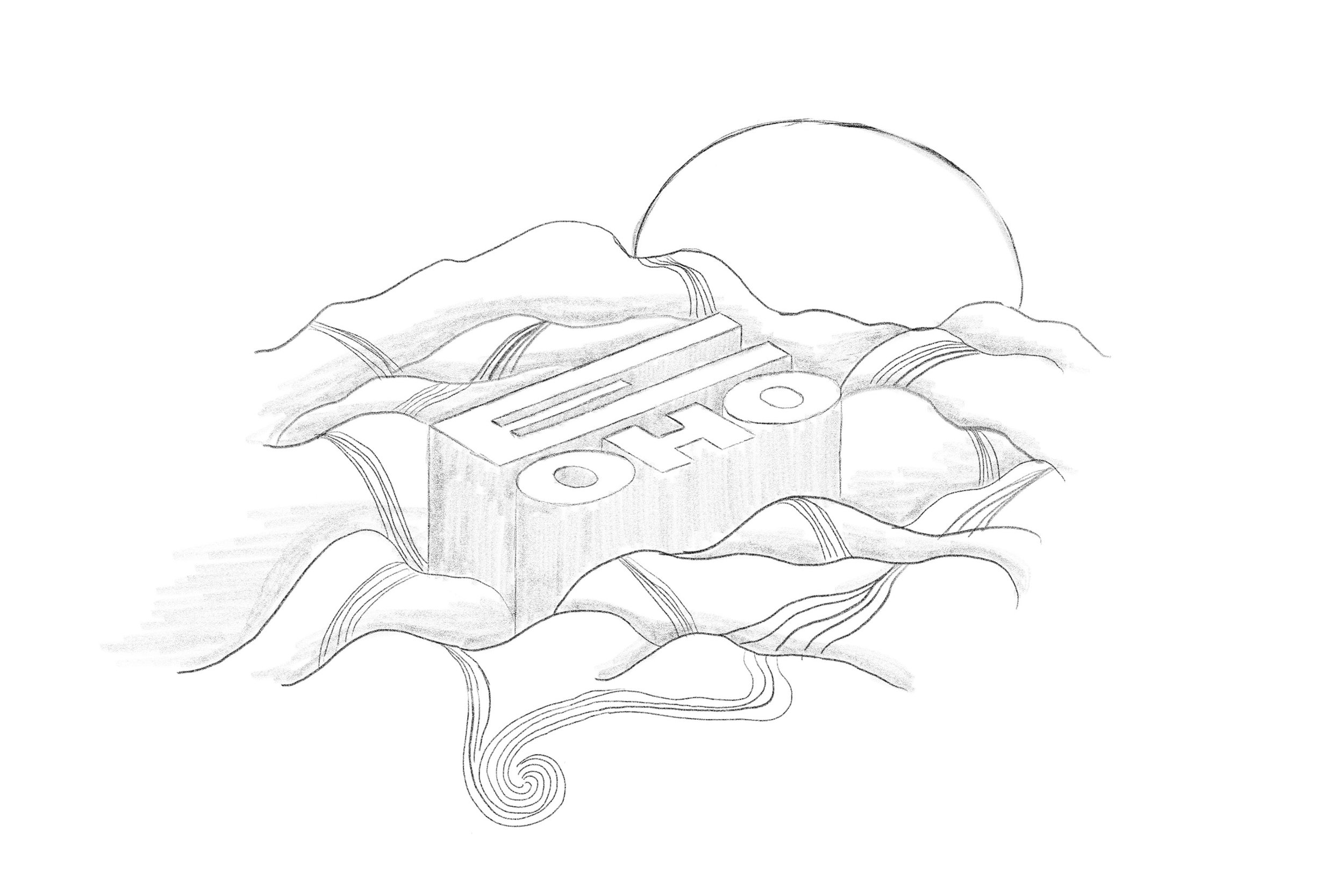
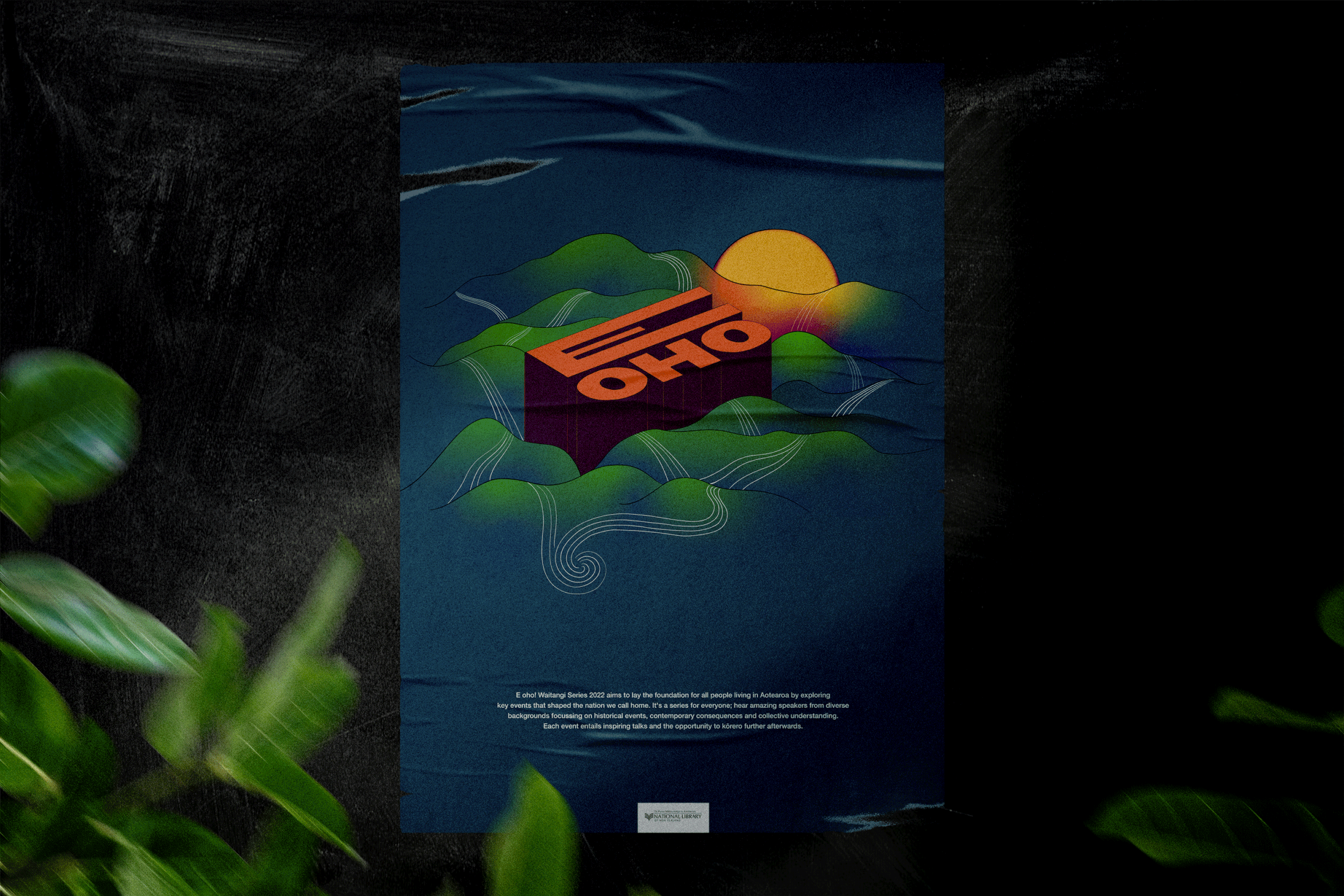
Concept sketch
The beginning of every new day offers us the opportunity to ‘E oho’; to delve, to speak, to share, to learn, to find unity. Each person’s own complex story, including their whakapapa, is the running thread/s that builds up our nation’s narrative ... our worlds and lives are never so far apart. There is always a chance they can and will overlap.
Layers of rolling hills symbolise Aotearoa’s characteristic mountainous terrain. On the horizon a new day is breaking ... the sun glows as it ascends from behind the hills, shining its life giving light onto the land below.
The sun’s energy striking the hills provides us the opportunity to show light and dark (symbolising enlightenment and unknowingness). Strong but fine ‘threads’ or ‘storylines’ flow forth over the hills, rapidly running and finally converging into one. A metaphor for our individual stories ultimately being integral to a greater picture.
The words, ‘E Oho’ extend upwards, almost 3d nature, amongst the rolling landscape. Again this is a play on the idea of ‘arising’.
Every element in this composition is lovingly hand drawn using beautiful clean and humanistic lines. Elements flow organically and are offset against the blocky strength of the typography. Gradation of colours and tones give the illustration dimension.